12 laws of UX every designer should know (and how I use them)
Most good design decisions rest on a handful of old ideas from psychology. Here are the twelve UX laws I lean on most, explained in plain words with examples from real products.
A lot of design feedback sounds like taste. "Make the button bigger." "There are too many options." "This feels slow." Taste is hard to argue with, and harder to defend in a room full of stakeholders.
The good news is that most of that feedback isn't taste at all. It's psychology that researchers described decades ago, long before anyone designed an app. These patterns have names, and knowing them turns "I feel like" into "we know that".
Jon Yablonski collected many of them on his site, Laws of UX, which is well worth a bookmark. Below are the twelve I use most, with what each one means and how it shows up in my work.
1. Jakob's Law
People spend most of their time on other products, so they expect yours to work the same way. Named after Jakob Nielsen, this is the reason search lives at the top, the logo goes home and a cart sits in the corner.
How I use it: before designing any common pattern, like a table filter or a file upload, I look at how the tools my users already live in handle it. Then I follow that unless I have a strong reason not to. Familiar is fast.
2. Fitts's Law
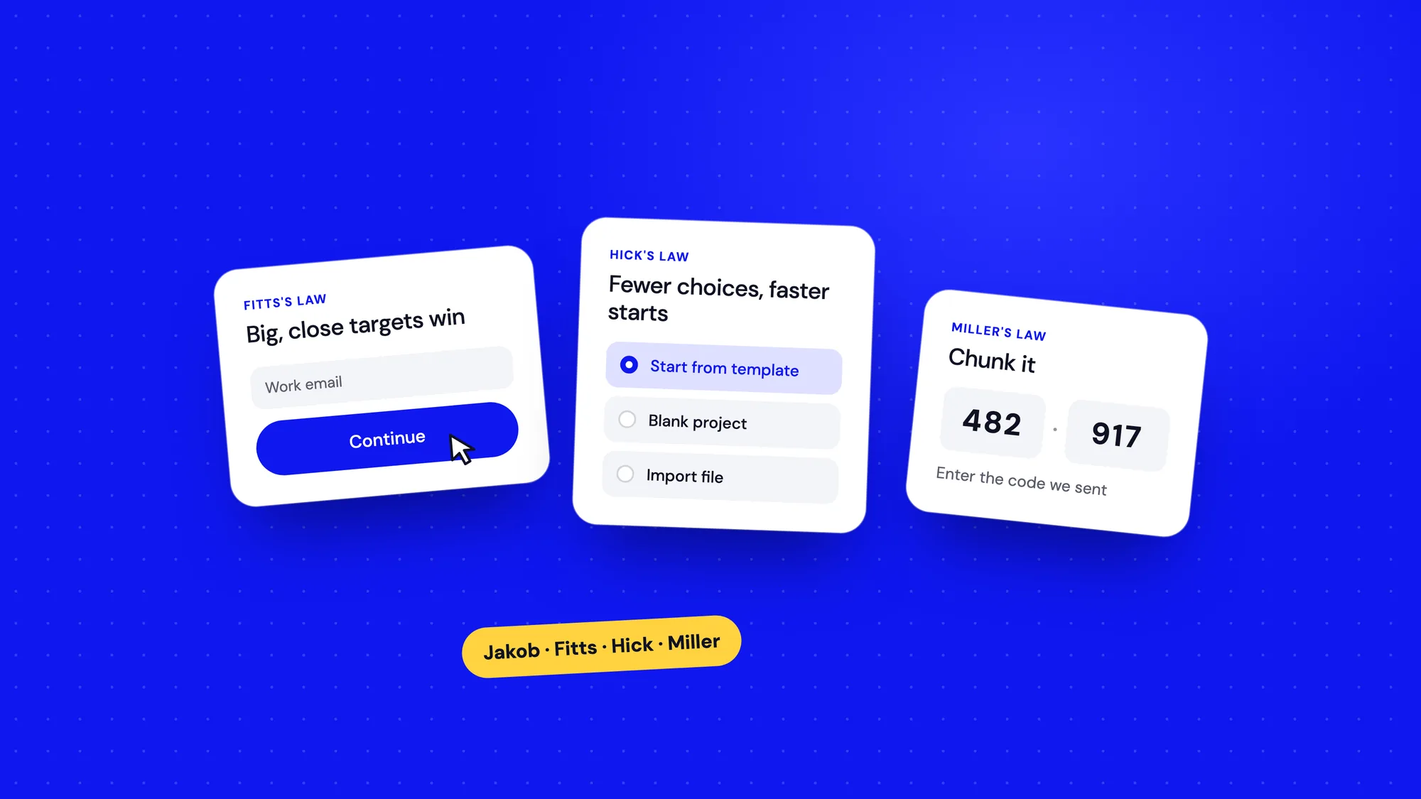
The time it takes to hit a target depends on its size and how far away it is. Big, close targets are quick. Small, distant ones are slow and easy to miss, especially with a thumb.
- Make primary buttons large, and give touch targets at least 44 pixels of tappable space.
- Put actions near the thing they act on. A delete icon belongs on the row, not in a toolbar across the screen.
- Keep destructive actions away from frequent ones, so a slip doesn't cost someone their data.
3. Hick's Law
The more choices you show, the longer it takes to pick one. Every extra option adds a little thinking time, and on a busy day that adds up to people giving up.
How I use it: in onboarding for Bharat Carbon, we didn't show every setting on day one. New users saw a short checklist of the next steps that mattered. Everything else waited until they needed it. Fewer choices, faster starts.
4. Miller's Law
George Miller's famous paper suggested we can hold about seven items, give or take two, in short-term memory. Later research suggests the real number is lower. Either way, the lesson isn't "menus can have seven items". It's that memory is small, so group things into chunks.
That's why phone numbers are split into groups and why a long form feels easier when it's broken into a few clear sections. Don't make people remember what they saw on the previous screen. Show it again.
5. Tesler's Law
Every system has some complexity that can't be removed, only moved. Larry Tesler's point was that either the product handles it or the user does. Good design takes on as much as it can.
Carbon accounting is genuinely complex. In the AI Document Manager, we let the system read utility bills and pull out the numbers, instead of asking people to type them in. The complexity didn't vanish. We just carried it, so users didn't have to.
6. The Doherty Threshold
When a system responds in under about 400 milliseconds, people stay in flow. Slower than that and attention starts to drift. Speed isn't just engineering, it's experience.
- Respond instantly, even if the work isn't finished: a pressed state, a spinner, a skeleton screen.
- Use optimistic updates for actions that almost always succeed, like starring an item.
- For long jobs, show real progress and let people carry on with something else.
7. The aesthetic-usability effect
People see attractive designs as easier to use, and they're more forgiving of small problems in them. That's a real advantage, and also a trap. A beautiful prototype can hide usability issues in testing because people are too polite to criticise it.
How I use it: polish matters for trust, especially in finance and climate products. But I test early with rough designs too, so the visuals don't cover up a confusing flow.
8. The Von Restorff effect
When several similar things are shown, the one that's different gets remembered. It's the reason a single blue button stands out on a calm page.
The flip side: if everything is highlighted, nothing is. Save your strongest colour, size and motion for the one thing you most want people to notice.
9. The serial position effect
People remember the first and last items in a list best. The middle blurs. Put the most important navigation items at the start and end, and don't bury key information in the middle of a long page.
10. The peak-end rule
People judge an experience mostly by how it felt at its most intense point and at the end, not by the average of every moment. A smooth checkout with a confusing final screen will be remembered as confusing.
How I use it: I spend extra time on the moments that carry emotion, like the first success, an error and the final confirmation. A clear "You're all set" screen with an obvious next step is cheap to design and lifts how the whole flow feels.
11. The goal-gradient effect
The closer people get to a goal, the faster they move towards it. A loyalty card with two stamps already filled gets completed sooner than an empty one.
Progress bars, step counters and checklists use this. Showing "Step 3 of 4" or a setup list with a couple of items already ticked gives people the push to finish.
12. The Zeigarnik effect
We remember unfinished tasks better than finished ones. That nagging feeling of something left undone is a powerful pull back into a product, if you use it kindly.
A profile that says "80% complete" or a draft that's saved and waiting both draw people back. Just don't turn it into guilt. A gentle reminder helps. A red badge that never goes away is just noise.
Where these laws get misused
Because they sound scientific, UX laws are easy to quote out of context. A few misuses I see often:
- "Miller's Law says menus can only have seven items." It doesn't. It's about memory, not menus. People scan a visible list, they don't memorise it.
- "Hick's Law means we should hide everything." Hiding options adds clicks and makes features hard to find. The goal is fewer choices at each step, not fewer features.
- "Make it pretty and people will love it." The aesthetic-usability effect makes people forgiving, not blind. Pretty and confusing still loses.
- "Use the Zeigarnik effect to boost engagement." Nagging people about unfinished tasks for your metrics, not their goals, quickly turns into a dark pattern.
The test I use: is this law helping the user do what they came to do? If it's only helping a number on a dashboard, I step back.
Laws are tools, not rules
None of these laws will design a product for you. They sometimes pull in different directions. Hick's Law says fewer choices, but hiding options can make a power user's day slower. That's where judgement and research come in.
What the laws give you is a shared language. When you can say "this button is small and far from the form, so Fitts's Law says people will miss it", feedback stops being opinion and starts being a conversation about evidence.
Good design isn't magic. It's mostly respecting how people already think.
A quick checklist
- Does this follow patterns people already know? (Jakob)
- Are key targets big and close to where people are working? (Fitts)
- Have I cut the choices down to what matters now? (Hick)
- Is information grouped into chunks people can scan? (Miller)
- Is the product carrying the complexity, not the user? (Tesler)
- Does everything respond within a blink? (Doherty)
- Is there one clear thing that stands out? (Von Restorff)
- Do the peak and the end of the flow feel good? (Peak-end)