Human first
Start with the person, not the pixel. Warm words, real faces, a mascot who waves back.
Brand experience · v1.0
Everything that makes this site feel like Ramesh Reddy, from a 4px spacing step to the way a button fills with colour on hover. Every sample on this page is the real component, running the same code as the rest of the site.
01
Four ideas sit behind every decision. When a choice is unclear, the one that serves these wins.
Start with the person, not the pixel. Warm words, real faces, a mascot who waves back.
Motion and play earn their place by making things clearer. If it only shows off, cut it.
Buttons that fill with colour, a fringe that moves in the wind, pills you can throw. Small, and never in the way.
One blue, one typeface, plain sentences. Say what it is, show the work, skip the jargon.
02
An "R" built from two arrows meeting a straight line: direction, momentum and a steady spine. It comes in three forms.
Keep empty space around the icon equal to the width of the mark's spine × 3 (shown as x). Nothing else enters that box.
Below these sizes the arrows fill in. Use the favicon file under 32px.
03
One confident blue on lots of white, with bluish neutrals for text. Accents are rare and always mean something. Click any swatch to copy its token.
Roughly how much of a typical screen each colour should cover.
Text and background pairs used on the site, with their WCAG contrast.
04
DM Sans, everywhere. Geometric but friendly, with open counters that stay readable from 13px captions to 168px heroes.
Aa
DM Sans
ABCDEFGHIJKLMNOPQRSTUVWXYZ
abcdefghijklmnopqrstuvwxyz
0123456789 ₹$€ &@?!→·“”
--track-displayBig and tight−0.035em · 64px+
--track-headingSection heading−0.025em · 28–63px
--track-titleCard title−0.01em · 18–27px
text-wrap: balance on headings.Let's build something human.
Type to try your own words.
05
A 4px base, generous whitespace and soft corners. Content sits in a 1180px column with fluid gutters.
--r-sm 12 · bars, tiles--r-md 16 · inputs, images--r-lg 24 · cards, panels--r-xl 32 · big media--r-pill · buttons, chips--max1180px content width--gutterclamp(20px, 5vw, 64px).section140px between sections--header-h110px · 84px under 860pxYou're viewing at —.
06
Inline SVG on a 24px box, 2px round strokes, currentColor. Icons support a label; they rarely replace one.
07
The building blocks, live. Hover, click and tab through them.
.btn .btn--{primary|soft|line|ghost} .magnetic.chips > .chip.is-active[aria-pressed].pill .pill--{blue|ink|teal|orange|red|ball}Decorative skill labels in the hero and the footer pit. Drag them here. They're not buttons, so they never carry an action.
.page-hero__eyebrow · .hire__badge · .footer__statusSelected work
Booking from Dec 2026
Open to new projects
Most popular
.section-headWriting
Kicker, then title, then an optional aside on the right that wraps below on mobile.
.field · .field.is-invalid · .field__error.plan · .plan--featuredFreelance
For teams with a clear, defined project.
From $2,500
Most popular
Part-time
Steady design without a full-time hire.
From $1,800
.projects__head · .card · .card__tags · .card__mediaCEO App · Bharat Carbon
UX research, user interviews, visual design, prototyping
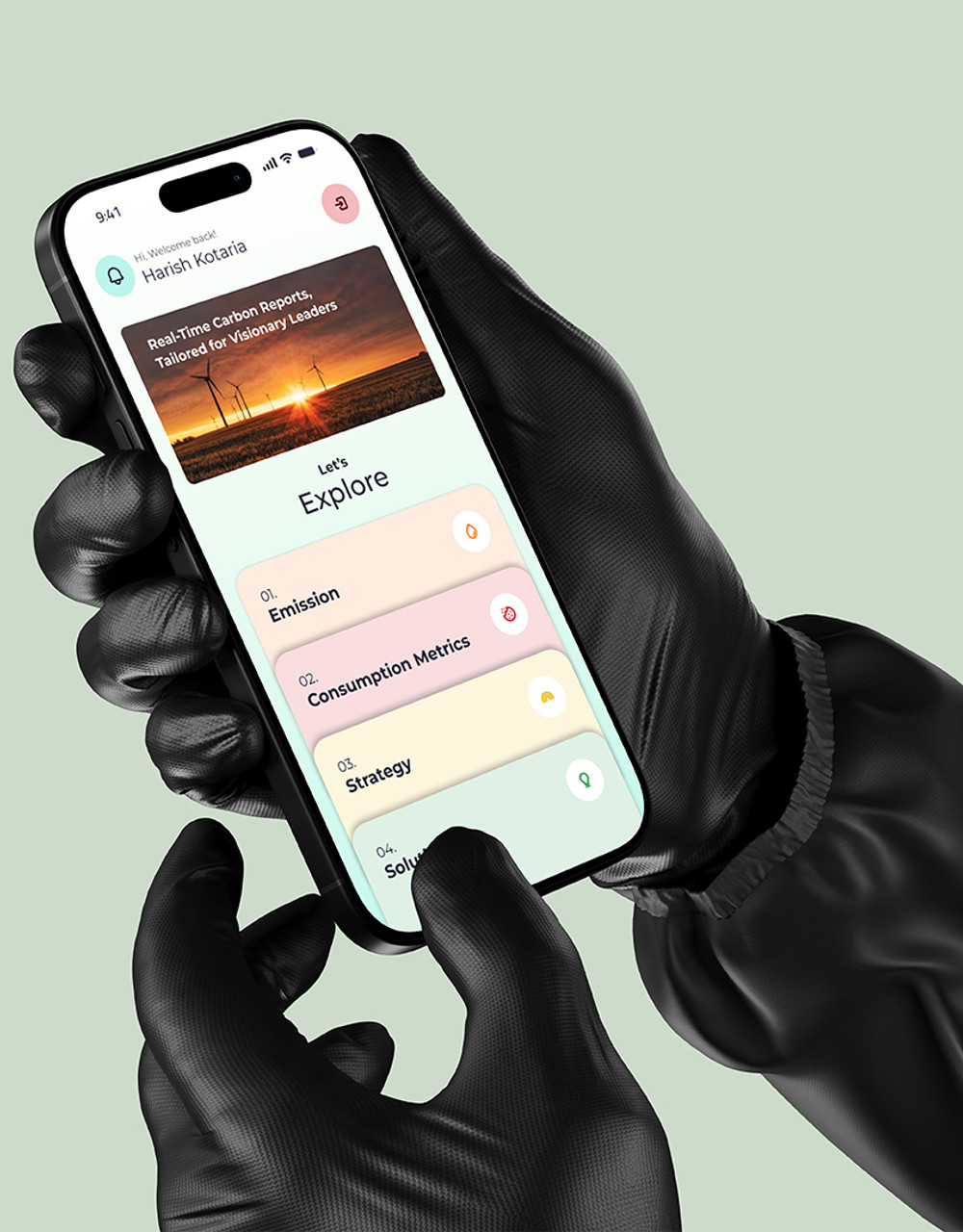
--tint is the project colour. Only the dot and a 16% image backdrop use it.Page.art(seed, kind, colours)Same seed, same art, every time. Use until real imagery exists. Click a tile for a new seed.
08
The mascot is the brand's warmest voice. Drawn in code from Ramesh's portrait: long silky hair that moves in the breeze, rimless glasses, a brand-blue overshirt.
<div class="mascot" data-mascot="wave" data-full></div>
data-full) for heroes, plans and the footer.09
Fast in, soft landing. Things arrive with a confident expo ease, then settle. Press play on each curve.
0.3–0.5sHover: colour, button fill, chip0.8–1.1sReveals: fade-up, line rise1.2–1.4sHero title, clip reveals, curtain2sCounters0.025–0.1sStagger between siblingstransform. CSS uses translate for hover lifts.prefers-reduced-motion: no loops, instant reveals.data-revealdata-linesHeadings rise
line by line
data-clipdata-count40+
10
Write like Ramesh talks across a table over coffee: warm, direct and a little playful. First person, short sentences, real examples.
Let's build something human.
Leveraging synergies to deliver best-in-class experiences.
This page doesn't exist, or it moved.
ERROR 404: The requested resource could not be located.
Add the full email, like name@company.com
Invalid input.
Schedule a Call
Click here to learn more about scheduling
11
Delight is never a barrier. Everything playful has a plain path around it.
Body text meets AA. Blue on white is 8.7:1, so blue text is safe at any size.
Every action is a real link or button with a visible focus ring. Try tabbing through this page.
Buttons are 50–56px tall, chips 40px with spacing. Icon buttons stay 44px or more.
With reduced motion on, loops stop, reveals show instantly and smooth scroll turns off.
Decorative art and the mascot are aria-hidden. Meaningful images describe what they show.
No text under 13px, lines under 75 characters, and zooming to 200% never hides content.
12
Tick through this for every new page or section. Your ticks stay in this browser.
All clear. Ship it. 🚀