The screens nobody designs: empty, loading and error states
Mockups show perfect data and happy paths. Real users meet empty lists, slow networks and failed uploads. These forgotten states are where products earn or lose trust.
Open any design file and you'll see the product on its best day. The table is full, the chart has a lovely upward curve, every name fits neatly in its column. It's the version that goes into the pitch deck.
Real users rarely see that version. They see an empty dashboard on day one, a spinner on a slow connection, a form that rejects their phone number and a name that's three times longer than the one in the mockup. These moments are where people decide whether a product is solid or flimsy.
I design these states on purpose, early, as part of every feature. Here's how I think about them.
Empty states: the first impression you forgot
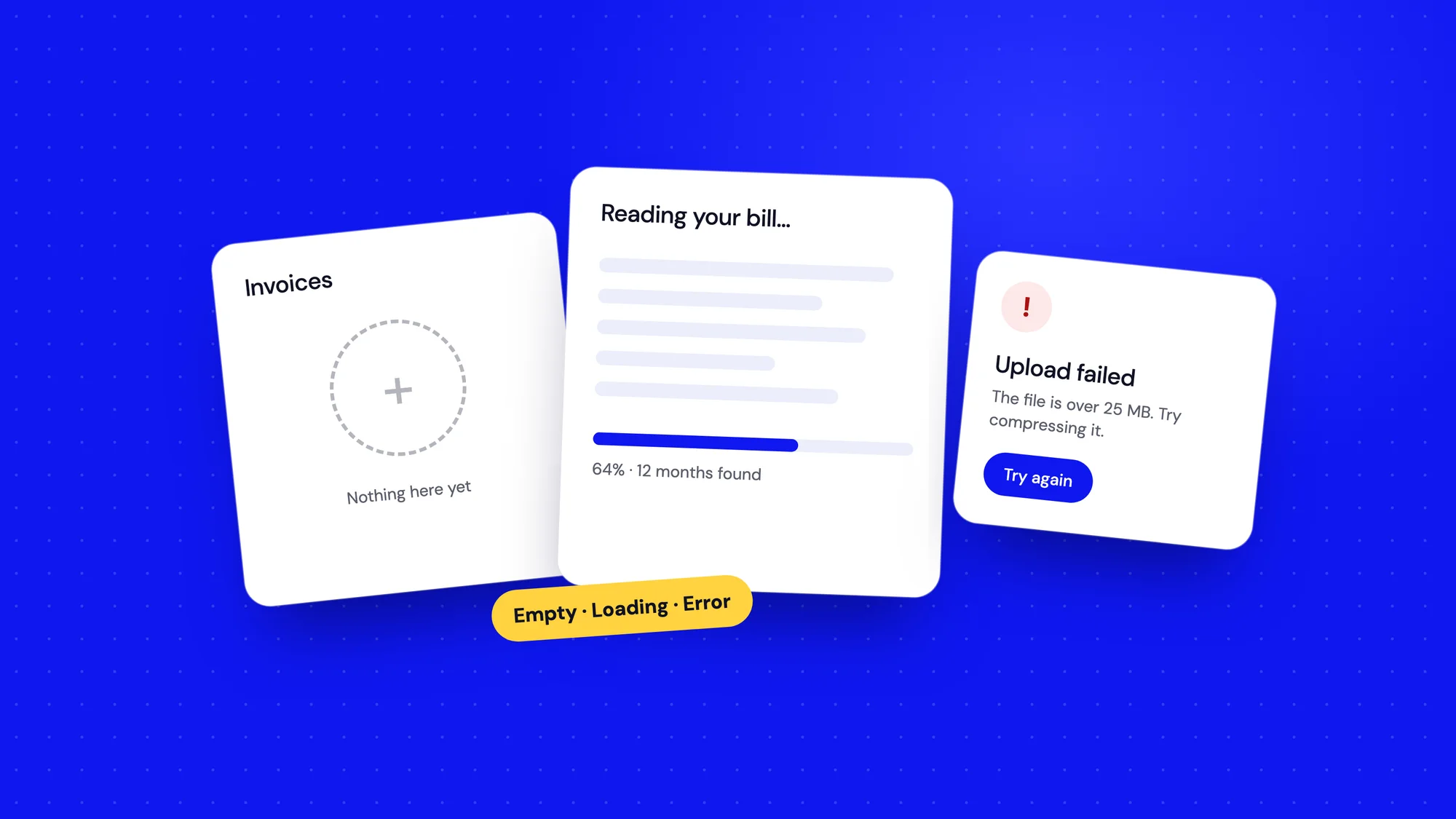
An empty state is what someone sees when there's nothing to show yet. It's often the very first screen a new user meets, which makes it one of the most important screens in the product. Yet it's usually designed last, if at all, ending up as a grey "No data" in the middle of the page.
There are three kinds worth designing separately:
- First use: nothing has been added yet. This is a chance to teach and motivate.
- Cleared by the user: they finished every task or archived everything. This deserves a small celebration, not a shrug.
- No results: a search or filter returned nothing. This needs a way out, like clearing filters or trying another word.
A good empty state answers three things: what will appear here, why it's worth having, and how to get started, ideally with a single clear action. On the Bharat Carbon home screen, instead of a dashboard full of zeros, new users see a checklist of what to add first. The empty state becomes the onboarding.
An empty screen is never empty. It's either teaching something or losing someone.
Loading states: making waiting feel shorter
Nobody likes waiting, but uncertainty is worse than waiting. A blank screen for three seconds feels longer than a well-designed three-second load, because people don't know if anything is happening.
- For short waits, use skeleton screens that show the shape of what's coming. They feel faster than spinners.
- For longer tasks, show progress and say what's happening: "Reading your bill… extracting 12 months of data."
- For actions you're confident about, update the screen straight away and sync in the background.
- Never block the whole page if only one part is loading.
This matters even more with AI features. When the AI Document Manager reads an uploaded bill, the processing state explains what the AI is doing. It turns a mysterious wait into visible work, and it sets the expectation that the result will need a quick check.
Error states: where trust is won or lost
Errors are inevitable. Networks fail, files are the wrong format, people mistype their email. What matters is how the product behaves when it happens. A good error message does three things:
- Says what happened, in plain words. "We couldn't upload your file", not "Error 413".
- Explains why, if it helps. "The file is larger than 25 MB."
- Shows how to fix it. "Try compressing it, or upload the pages separately."
Equally important: never lose someone's work. If a form fails to submit, keep everything they typed. Few things make people angrier than retyping a long form because of an error that wasn't their fault.
Tone matters too. Don't blame the user, and don't joke when someone has just lost something important. Calm, clear and helpful works for every error.
Validation: timing is everything
Inline form validation is helpful when it's timed well and infuriating when it isn't. Telling someone their email is invalid after they've typed one letter feels like being interrupted mid-sentence.
I validate a field when the person leaves it, then switch to live feedback once they're fixing an error, so they see the message disappear as soon as it's right. Requirements, like password rules, should be visible before people start typing, not revealed one failure at a time.
The edge cases that break layouts
Beyond empty, loading and error, there's a long list of everyday situations that mockups ignore. I keep a checklist and run through it for every screen:
- Zero, one, a few and thousands of items.
- Very long names, titles and email addresses.
- Huge numbers, negative numbers and missing values.
- No permission: what does someone see if they're not allowed in?
- Slow or no connection.
- Small screens, large text settings and keyboard-only use.
- Partial data, like a profile with no photo or a company with no address yet.
Most of these take minutes to design once you think of them. Discovering them after launch takes much longer, and usually happens in front of a customer.
Success states: close the loop
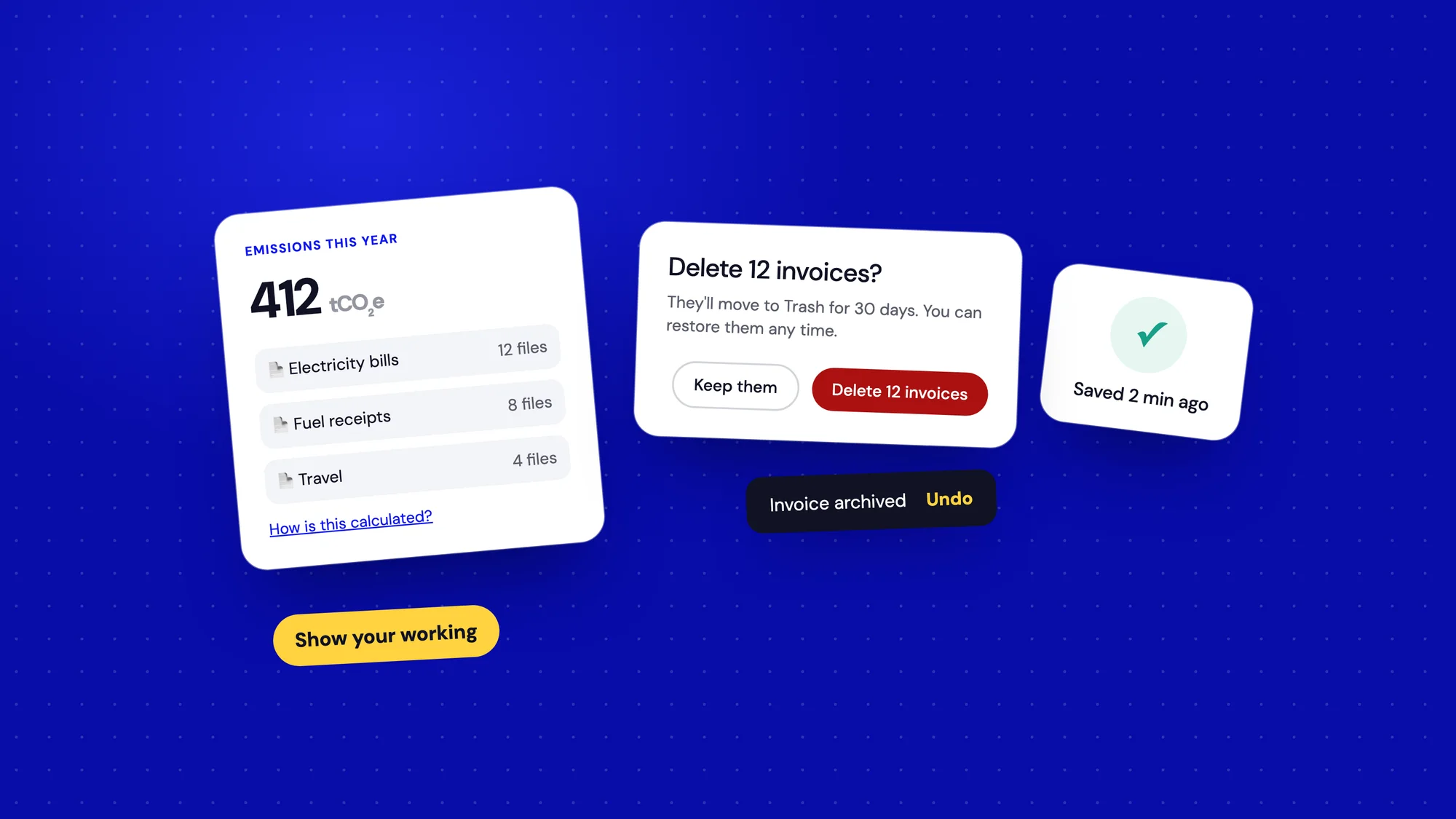
Success is a state too, and it's often under-designed. A form submits and… nothing visible happens. Did it work? People click again, and now there are two invoices.
Every action that changes something should confirm it. For small actions, a short toast or an inline tick is enough. For bigger moments, like finishing onboarding or submitting a report for approval, it's worth a proper screen that says what happened and what comes next. A moment of celebration costs little and makes people feel progress.
A worked example: uploading a file
Here's how the states play out for something as ordinary as uploading a document:
- Empty: a clear drop zone that says which file types and sizes are accepted.
- Selected: a preview with the file name and size, and a way to remove it.
- Uploading: progress with a percentage, and the option to cancel.
- Processing: a short explanation of what's happening, especially if it takes more than a few seconds.
- Error: what went wrong and how to fix it, with the rest of the form still filled in.
- Success: confirmation, and a link to the uploaded document or the next step.
- No access: if someone can't upload, a message explaining who can.
That's seven states for one small feature. Designing them takes an hour or two. Leaving them to chance means they'll be invented under pressure, one by one, by whoever happens to be fixing the bug.
Making it a habit
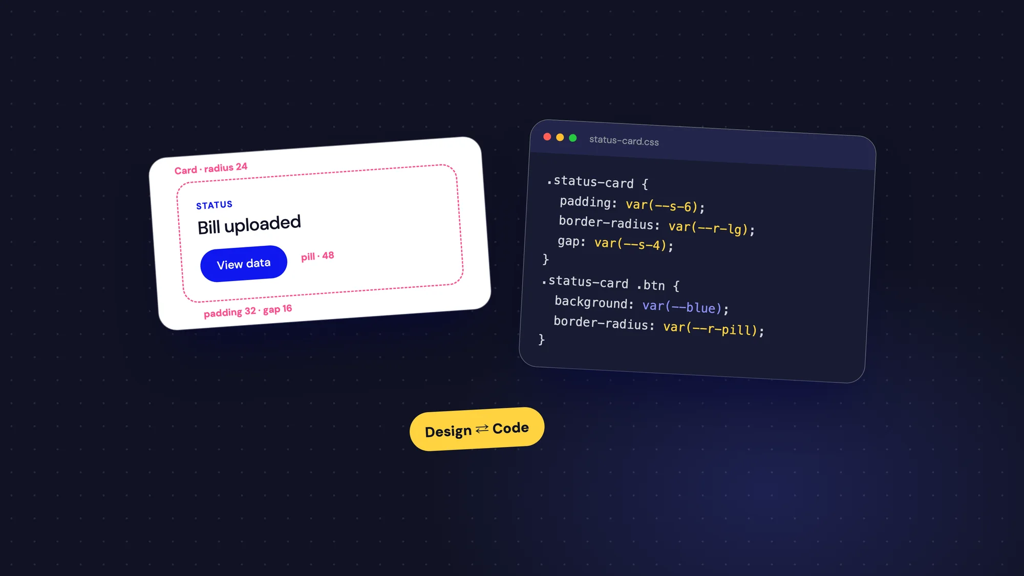
The easiest way to stop forgetting these states is to build them into your process and your design system.
- Add empty, loading and error variants to your core components: tables, cards, charts and forms.
- For each new feature, design a simple state grid: default, empty, loading, error, partial and no access.
- Write the copy for every state together with the main screen, not as an afterthought.
- Review states in design critiques, not just the happy path.
Developers love this too. When every state is designed, they don't have to invent messages or guess layouts at the last minute, and the product feels consistent instead of patched together.
The unglamorous screens matter most
Nobody shares a screenshot of a well-designed error message. But users remember how a product treated them when things went wrong. Calm, helpful states build quiet confidence, the kind that turns a trial into a habit.
Design the bad days as carefully as the good ones. Your users will notice, even if they never say so.