Design handoff that developers actually thank you for
Handoff isn't a moment when you throw a Figma link over the wall. It's a working relationship. Here's how I make sure what gets built matches what was designed.
Every designer has lived this story. You spend weeks on a feature, share the Figma link, and a month later the built version arrives. The spacing is off, the empty state is missing, the error message says "Something went wrong" and the button that should be disabled isn't.
It's tempting to blame developers. But in my experience, most of those gaps come from the handoff, not the build. Developers can only build what's clear. Here's how I make handoff smoother, and how it's earned me more than a few thank-you messages from engineering teams.
Handoff is a relationship, not a moment
The biggest shift for me was to stop thinking of handoff as a single event. If the first time a developer sees a design is the day it's "done", you've already lost. They'll find technical problems you didn't know about, and every change from that point costs more.
Bring developers in early. Share rough flows and ask: is anything here unusually hard? Is there an existing component we could use? Is the data actually available? Ten minutes of feasibility talk early on can save weeks of rework later.
The best handoffs feel like nothing was handed off, because everyone was there all along.
Design with the system
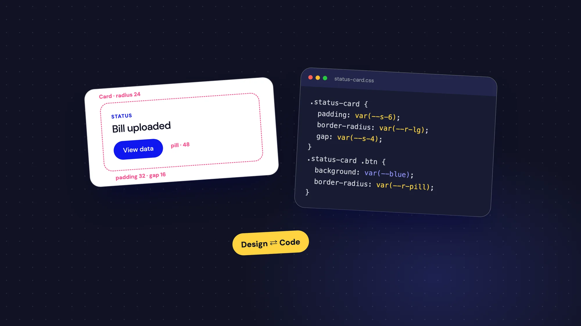
Developers build with components. When designs use the same components, with the same names, translation is easy. When every screen has slightly different buttons and seventeen shades of grey, developers have to guess which one is right, or build them all.
- Use components from your design system wherever possible, and flag anything new clearly.
- Use tokens or variables for colour, spacing, type and radius, named the same way as in code.
- Name layers and frames properly. "Frame 1261153271" helps nobody.
- If you break a rule on purpose, say why, so it doesn't look like a mistake.
Specify behaviour, not just looks
A static screen shows one moment. Developers need to know how it behaves across all the others. This is where most handoffs fall short.
- Every state: default, hover, focus, disabled, loading, empty, error and success.
- Interactions: what happens on click, how long animations last, what closes a modal.
- Responsive rules: what stacks, what hides and what scrolls on smaller screens.
- Edge cases: long text, missing data, zero results and large numbers.
- Validation rules and exact error messages.
A short prototype for complex interactions saves a page of explanation. For simple ones, a note on the design is enough.
Write it down where they'll see it
Developers shouldn't have to hunt through Slack threads and meeting notes to understand a feature. Put the important information next to the design, in the file they'll open.
I add a short overview at the start of each feature: what problem it solves, the user flow, links to related tickets and a list of open questions. Then I annotate screens directly with anything that isn't obvious from the visuals. If the team uses user stories, I make sure the acceptance criteria match the designs exactly.
Use real content and real data
Lorem ipsum hides problems. A design that looks perfect with "John Doe" and "$1,200" might break with "Sri Venkateswara Constructions Private Limited" and "₹12,45,67,890.50".
Design with realistic content from the start: actual names, real ranges of numbers, true lengths of descriptions. It helps you catch layout issues early, and it gives developers realistic test cases for free.
Be clear about what can flex
Not every pixel matters equally, and developers appreciate knowing which ones do. If a deadline is tight, tell them what's essential and what's nice to have. "The status colours and the error messages must ship. The hover animation can come later."
That kind of clarity builds trust in both directions. Developers stop feeling like they'll be judged on every pixel, and you get the important details right.
Stay around after handoff
Questions always come up during the build. The faster they're answered, the less likely someone is to guess. I keep an open channel with the developers on a feature and try to reply within hours, not days.
- Review builds early, on a staging link, not just at the end.
- Do a design QA pass with screenshots and clear, prioritised notes.
- Pair with a developer for half an hour to fix small visual issues together.
- Celebrate good implementation. Developers rarely hear that something was built beautifully.
Don't forget accessibility
Accessibility is one of the easiest things to lose in handoff, because much of it is invisible in a static design. If you don't specify it, it's often skipped, not out of carelessness but because nobody knew it was needed.
- Focus states for every interactive element, and the order focus should move in.
- Text alternatives for meaningful images and icons.
- Colour contrast that passes, checked in the design, not after the build.
- Labels for form fields that stay visible, not placeholder-only.
- What a screen reader should announce for status changes, like "File uploaded".
Run a short walkthrough
Documentation is essential, but a thirty-minute walkthrough answers questions no document can predict. I keep it simple: the problem we're solving, the main flow from start to finish, the tricky states and the open questions. Then I let the developers drive and ask whatever comes to mind.
Record it if your team works across time zones. It becomes a useful reference for anyone who joins the project later, including future you.
Common gaps and how to close them
- "What happens when this fails?" Design and write every error.
- "Which grey is it?" Use tokens, not raw values.
- "Is this a new component?" Mark new and changed components clearly.
- "How does this look on mobile?" Show at least one small-screen layout for each key screen.
- "Is this final?" Mark work in progress so nobody builds a draft.
When designs change mid-build
Designs will change after handoff. A stakeholder spots something, research turns up a surprise, a technical limit forces a rethink. That's normal. What causes trouble is changing designs silently.
When something changes, tell the developers directly, explain why and mark exactly what moved. Keep a short changelog at the top of the file with dates. It takes two minutes and prevents the painful moment when someone builds last week's version of a screen.
A quick handoff checklist
- Developers have seen the design before it's final.
- Components and tokens match the design system and the code.
- All states and edge cases are designed.
- Interactions and responsive rules are described.
- Copy is final, including errors and empty states.
- Realistic content and data are used throughout.
- Priorities are clear: what must ship and what can wait.
- There's a time booked to review the build.
Good handoff is good design
A design isn't finished when it looks right in Figma. It's finished when it works right in people's hands. Getting there is a team sport, and the designers developers love working with are the ones who make that sport easy to play.
Developers don't need prettier files. They need fewer guesses.