Designing for trust: how good products earn belief
People hand products their money, their data and their decisions. Trust isn't a badge you add at the end. It's built, or broken, in hundreds of small design choices.
Think about the products you trust the most. Probably your bank's app, your email, maybe a tool you use every day at work. Now think about why. It's rarely one big thing. It's that they behave the same way every time, they tell you what's going on and they've never surprised you in a bad way.
Trust is the quiet foundation of every product, and it's even more important when you're asking people for money, personal data or important decisions. I've designed for carbon accounting, compliance documents and property records, where a wrong number has real consequences. Here's what I've learned about earning trust through design.
Trust is built in small moments
Badges, padlock icons and "bank-grade security" banners have their place, but they're not where trust really comes from. People trust products that behave reliably, explain themselves and treat them fairly. Those qualities show up in hundreds of small details.
Trust isn't a feature you ship. It's a promise you keep, screen after screen.
1. Be predictable
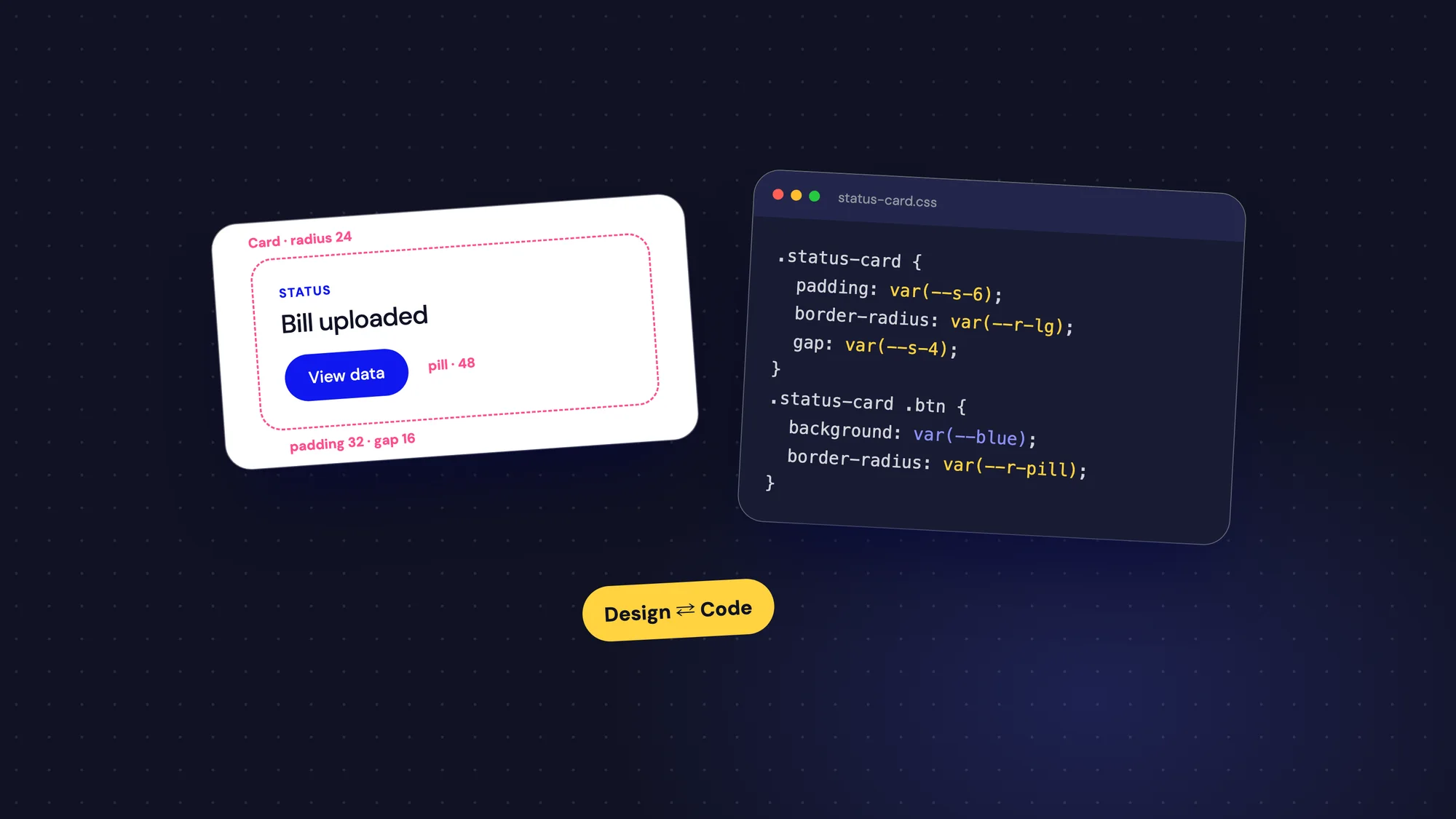
Consistency is the cheapest way to earn trust. When the same button looks and works the same everywhere, people stop second-guessing. When a cancel button suddenly moves to the other side of a dialog, they slow down and wonder what else might change.
- Use the same words for the same things across the product.
- Keep actions in consistent places, especially destructive ones.
- Make similar tasks follow similar steps.
A design system helps enormously here, not because it looks tidy, but because it makes the product behave the same way everywhere.
2. Show your working
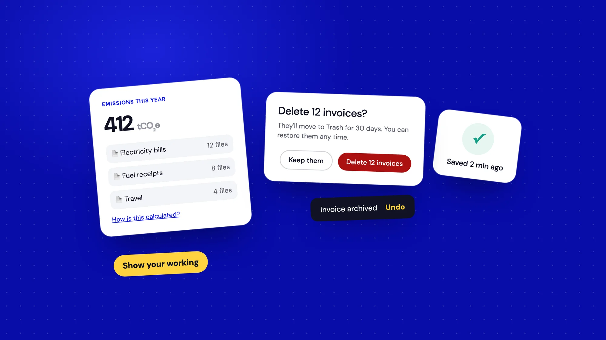
When a product gives people a number, especially one that matters, they want to know where it came from. A total with no explanation feels like a guess. A total they can trace back to its source feels like a fact.
In the AI Document Manager, we placed the original bill right next to the numbers the AI had extracted. Users could check any value against the source and edit it before saving. That one layout decision did more for trust than any accuracy claim could have.
- Link totals to the records behind them.
- Show when data was last updated and where it came from.
- Explain calculations in plain language, with a "how is this calculated?" link for curious minds.
3. Let people undo
People explore more confidently when mistakes are easy to fix. If every click feels permanent, they hesitate, and hesitation feels like distrust.
- Offer undo for common actions instead of asking "Are you sure?" every time.
- Save drafts automatically so nothing is lost.
- Save real confirmation dialogs for actions that truly can't be reversed, and say exactly what will happen.
- Use clear names on buttons in those dialogs: "Delete 12 invoices", not "OK".
4. Ask for data with a reason
Every form field is a small request for trust. People are more willing to share information when they understand why it's needed and how it will be used.
Ask only for what you need right now, and explain anything that might seem sensitive. A short line like "We use your industry to suggest the right emission factors" turns a nosy question into a helpful one. And never ask for something you could figure out yourself.
5. Be honest, especially when it's inconvenient
Dark patterns can lift a metric for a quarter, but they spend trust you'll need later. Pre-ticked marketing boxes, hidden cancellation flows, fake countdown timers and confusing opt-outs all teach users that your product is trying to trick them.
- Make cancelling as easy as signing up.
- Show the full price early, including taxes and fees.
- Use defaults that serve the user, not just the business.
- Tell people about limits before they hit them, not after.
Honesty is also good business. People recommend products that treat them fairly, and they stay longer with companies they believe.
6. Own your mistakes
Every product fails sometimes. How it fails shapes trust more than how it succeeds. A clear message that says what went wrong, what's being done and what the user can do keeps confidence intact. A vague error, or worse, silence, makes people assume the worst.
The same applies to bigger problems like outages or data issues. A short, honest status update beats a polished announcement that arrives too late.
7. Sweat the details
It may not seem fair, but people judge reliability by appearance. Typos, misaligned elements, inconsistent spacing and broken images all whisper "nobody is paying attention here". If the visible parts are careless, users assume the invisible parts are too.
Polish isn't vanity. On products that handle money or data, it's a signal of care.
A note on AI
AI features raise the stakes, because their output can be confidently wrong. Designing trust into AI means being clear about what it did and keeping people in control.
- Label AI-generated content so people know to check it.
- Show sources and confidence where you can.
- Make output easy to edit, accept or reject.
- Keep a human review step for anything with real consequences.
People don't need AI to be perfect. They need to be able to catch it when it isn't.
8. Respect attention
Notifications, emails and pop-ups are all withdrawals from the same account. Each one that's useful builds trust. Each one that's noise trains people to ignore you, or worse, to turn you off completely.
- Notify only when something needs attention or has changed in a way people care about.
- Let people choose what they hear about and how often.
- Group minor updates into a digest instead of sending them one by one.
- Never use urgency you don't mean.
9. Make help easy to reach
When people get stuck on something important, like a payment or a compliance deadline, the way out matters as much as the product itself. A help link buried three menus deep tells users they're on their own.
Keep help close to the moments that need it: a short explanation next to a complex field, a link to a guide on an empty screen, a visible way to contact a real person on high-stakes pages. Knowing help is there makes people braver, even if they never use it.
How to tell if it's working
Trust is hard to measure directly, but you can watch for signs of it, and signs of its absence.
- Drop-off at steps that ask for data or money. A sharp fall often means people aren't sure why you're asking.
- Support tickets that start with "Is this right?" or "Did it save?".
- People exporting data to check it in a spreadsheet, which often means they don't trust the numbers on screen.
- How often users override or edit automated results.
- What people say in interviews when you ask, "Would you rely on this for an important decision?"
Each of these points to a specific moment where the design could explain more, confirm more or ask less.
Trust compounds
Every reliable interaction adds a little trust. Every surprise takes some away. Over months, those small moments add up to the difference between a tool people tolerate and one they recommend to their colleagues.
People forgive a product that's simple. They rarely forgive one that tricked them.