Five flows every SaaS product has to get right
Features get the roadmap. Flows decide whether people stay, pay or quietly leave. Here are the five I design first on every SaaS product, with examples from my own work.
Imagine walking into a shop where nobody greets you, the aisles make no sense and the checkout is hidden in the basement. You'd walk out. Most people do the same with a confusing SaaS product. They just don't tell you why.
Founders love talking about features. But users don't experience features. They experience flows: the path from one screen to the next, and whether that path gets them to what they came for.
After designing carbon accounting tools, an AI document manager, a property platform and an admin suite, I keep coming back to the same five flows. If these work, the product feels easy. If one breaks, no feature can save it.
1. Sign up and onboarding
Onboarding is your first impression, and it decides whether someone stays ten minutes or ten years. The goal isn't to collect data. It's to get people to the useful part as quickly as possible, while learning just enough to shape what they see.
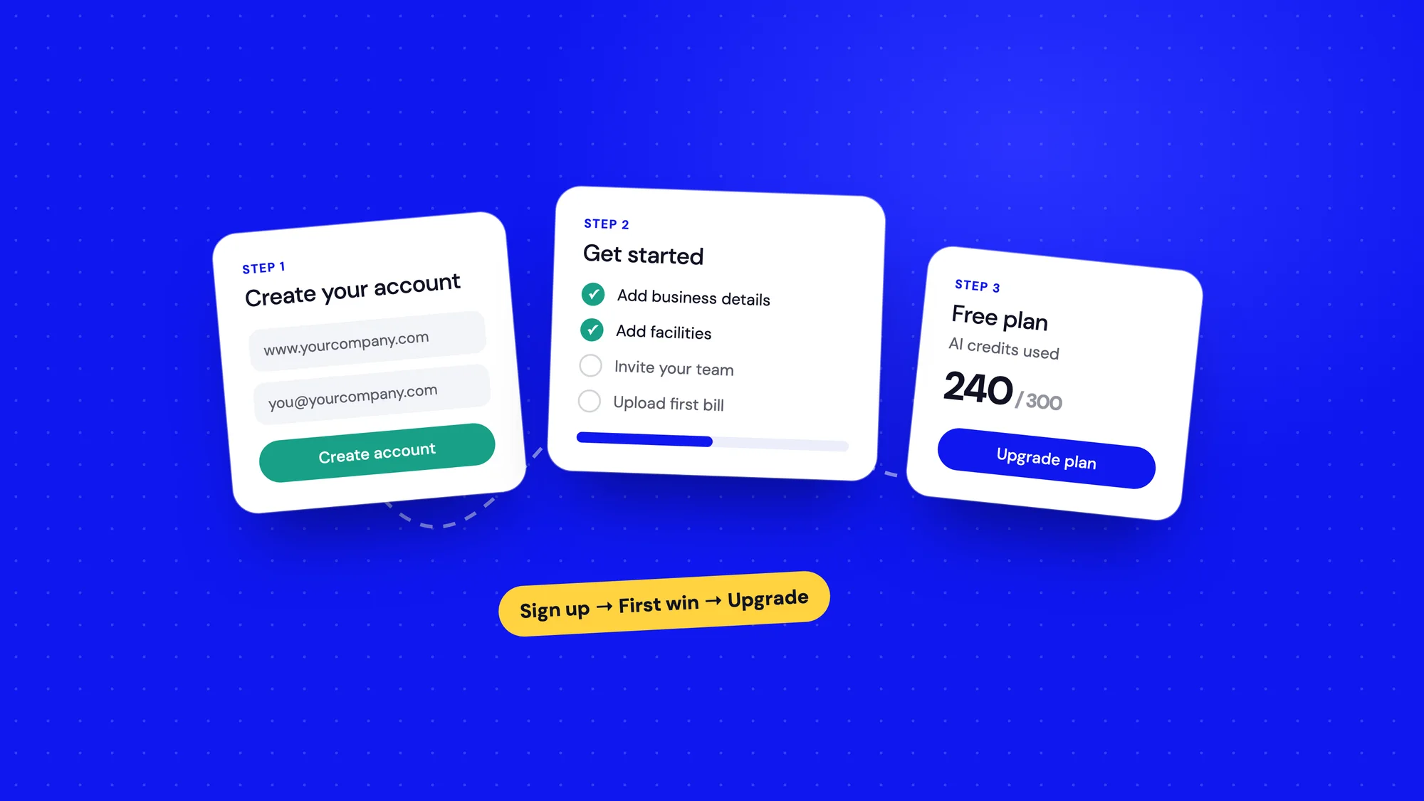
For Bharat Carbon, a carbon accounting platform for Indian businesses, we asked for the business website first. That one field let us lock sign-ups to the company's email domain and catch duplicates early. If your company already has an account, the form tells you straight away and points you to your admin.
- Ask only for what changes the experience. Everything else can wait.
- Use plain words. "What motivates you to cut emissions?" works better than a wall of ESG terms.
- Show progress. A simple bar tells people the end is near.
- Design the errors as carefully as the happy path. "Wrong code" and "Company exists" are part of onboarding too.
2. The first win
A new account is empty. That's the most dangerous moment in any SaaS product. Show someone a dashboard full of zeros and they'll assume the product doesn't work.
So I design home around the next step, not the data. On Bharat Carbon, a new user lands on their climate profile and a Get Started checklist: add business details, facilities, holdings, employees, suppliers, emission factors and users. Each card ticks off as it's done, and a short seven-stop tour explains the menu for anyone who wants it.
An empty screen should never ask "now what?". It should answer it.
3. The core job
Every SaaS product has one job people hire it for. In the AI Document Manager it was simple: upload a bill and stop typing numbers by hand. That flow has to be the smoothest thing in the product.
- Ask for context before the work. We asked which product, year, facility and bill type before the upload, so the AI knew what to look for.
- Keep people in control. The bill sits next to the extracted numbers, and every row can be edited before saving.
- Make every state visible. Uploading, processing, in review, approved, rejected. Nobody should wonder what's stuck.
4. Teams and permissions
B2B software is rarely used alone. Someone sets it up, others add data, a manager approves it. If inviting a teammate is hard, the product stays a one-person tool, and one-person tools are easy to cancel.
On RealEase, a property management platform, owners could invite collaborators to share the load. In Bharat Carbon, makers and checkers have clear roles, and admins manage who joins from one place. Good permission flows feel boring, and that's the point: people should trust them without thinking.
5. Plans, credits and upgrades
This is where many products get awkward. Pricing hides behind a sales call, limits appear as surprise errors, and upgrading feels like a trap.
I prefer to make the plan part of the product. On Bharat Carbon the current plan sits on the home screen, AI credits show in the header with a clear way to buy more, and Upgrade Plan has a permanent spot in the menu. People should always know what they have, what they've used and what more would cost, before they hit a wall.
- Show usage where value happens, not on a hidden billing page.
- Warn early. A limit should never be a surprise.
- Make upgrading one step, and make the difference between plans obvious.
Design the flows before the screens
When I start a SaaS project, I sketch these five flows end to end before I polish a single screen. It's the quickest way to spot the gaps: the missing error state, the teammate who can't get in, the user who signs up and then has nothing to do.
Features will change every quarter. These flows will be there for the life of the product. Get them right early, and every new feature has a solid path to land on.
Users don't remember your features. They remember how easy it was to get things done.
An earlier version of this article appeared on Medium as "Build It Right: 5 Must-Have Flows Every SaaS Product Needs to Nail".