Case study · Manufacturing · Website

Making polymers look anything but old.

A modern website for Nexapol that builds the brand and brings in B2B leads, designed in two weeks.
Client
Nexapol
Industry
Manufacturing · Polymers
Product
Company website, built in Wix Studio
Timeframe
2 weeks
My role
UX + UI design, information architecture, wireframing, visual design, prototyping
Tools
Figma, FigJam, Wix Studio
Links
Visit website
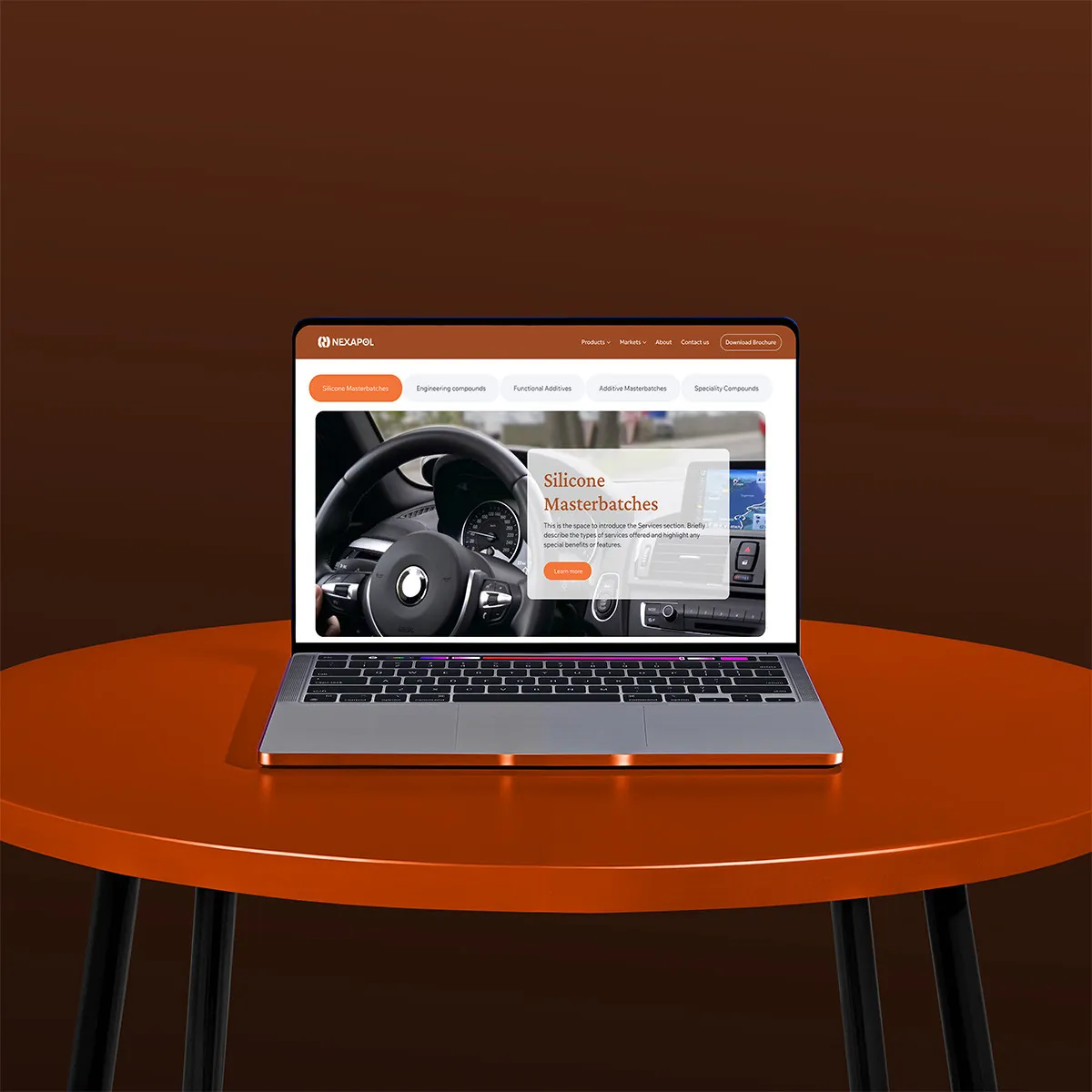
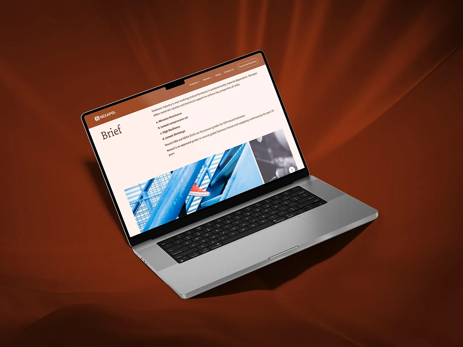
Nexapol website on a laptop

01 · The short version

The project in a minute

The problem

A great company, an old‑feeling industry

Plastics and polymers feel dated to most people. Nexapol needed a site that showed how forward‑looking they are.

What I did

Structure, then a bold look

Organised products and markets so buyers find answers fast, then gave it a warm, editorial visual style.

The result

A site built for leads

Five clear page types that build the brand and make it easy for business buyers to get in touch.

2weeks from brief to final design
5page layouts, from home to contact
5design goals, from modern to clear imagery
B2Bbuyers who need answers fast

02 · Who it's for

Built for business buyers

Procurement teams and partners want to know what Nexapol makes, which markets it serves, and how to reach someone.

Primary users

B2B buyers · Partners

“Show me you're modern, show me what you make, and let me reach you fast.”The brief in one line, as I framed it

  1. ModernA fresh look that lifts the brand.
  2. EngagingPages that feel good to use.
  3. InterestingA scroll that keeps people reading.
  4. Easy to findInformation that is well organised and quick to reach.
  5. Clear imageryHigh‑quality images that spark curiosity.

03 · How it came together

Two weeks, three steps

A tight timeline, so structure came first and the look followed.

  1. 1

    Step 1

    Organise

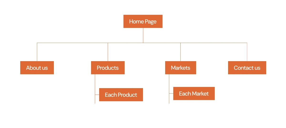
    The site map, with products and markets each getting their own detail pages.

    • IA
    • Site map
  2. 2

    Step 2

    Wireframe

    Layouts for all five page types, focused on what buyers look for first.

    • Wireframes
    • Content
  3. 3

    Step 3

    Style

    A warm palette, editorial headings and bold imagery, then a prototype for the build.
    • Visual design
    • Prototype
Nexapol site map
The site map: Home leads to About, Products, Markets and Contact, with a page for each product and each market.

04 · Key decisions

The choices that made it work

Decision 01

Warm and editorial, not grey

Why
The industry feels old. The site had to feel modern from the first second.
What I did
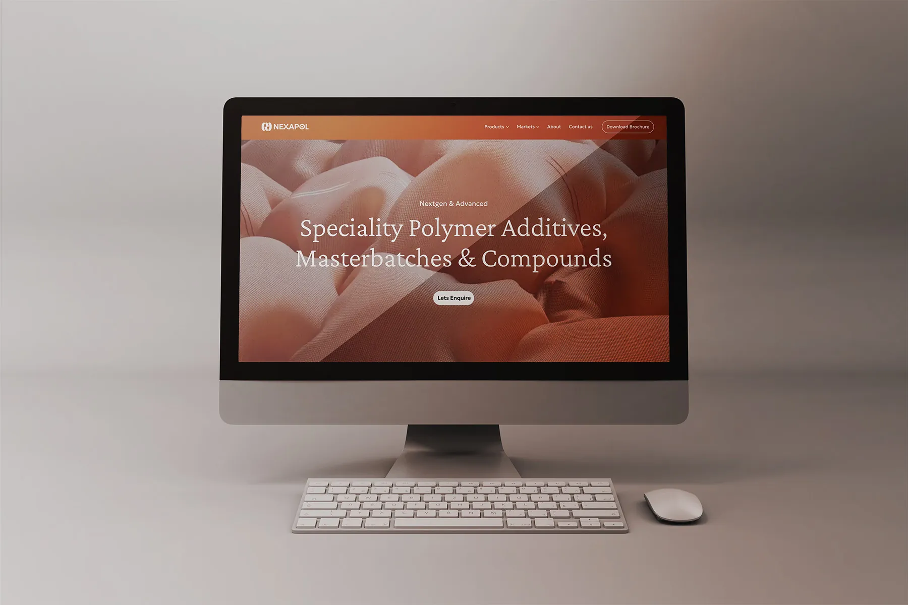
A rich rust palette, elegant serif headings and big imagery set Nexapol apart from typical manufacturers.
Nexapol home page

Decision 02

Two ways in: products and markets

Why
Some buyers know the product they need; others start from their own industry.
What I did
Products and Markets each get a landing page and detail pages, so both kinds of buyer find their way.
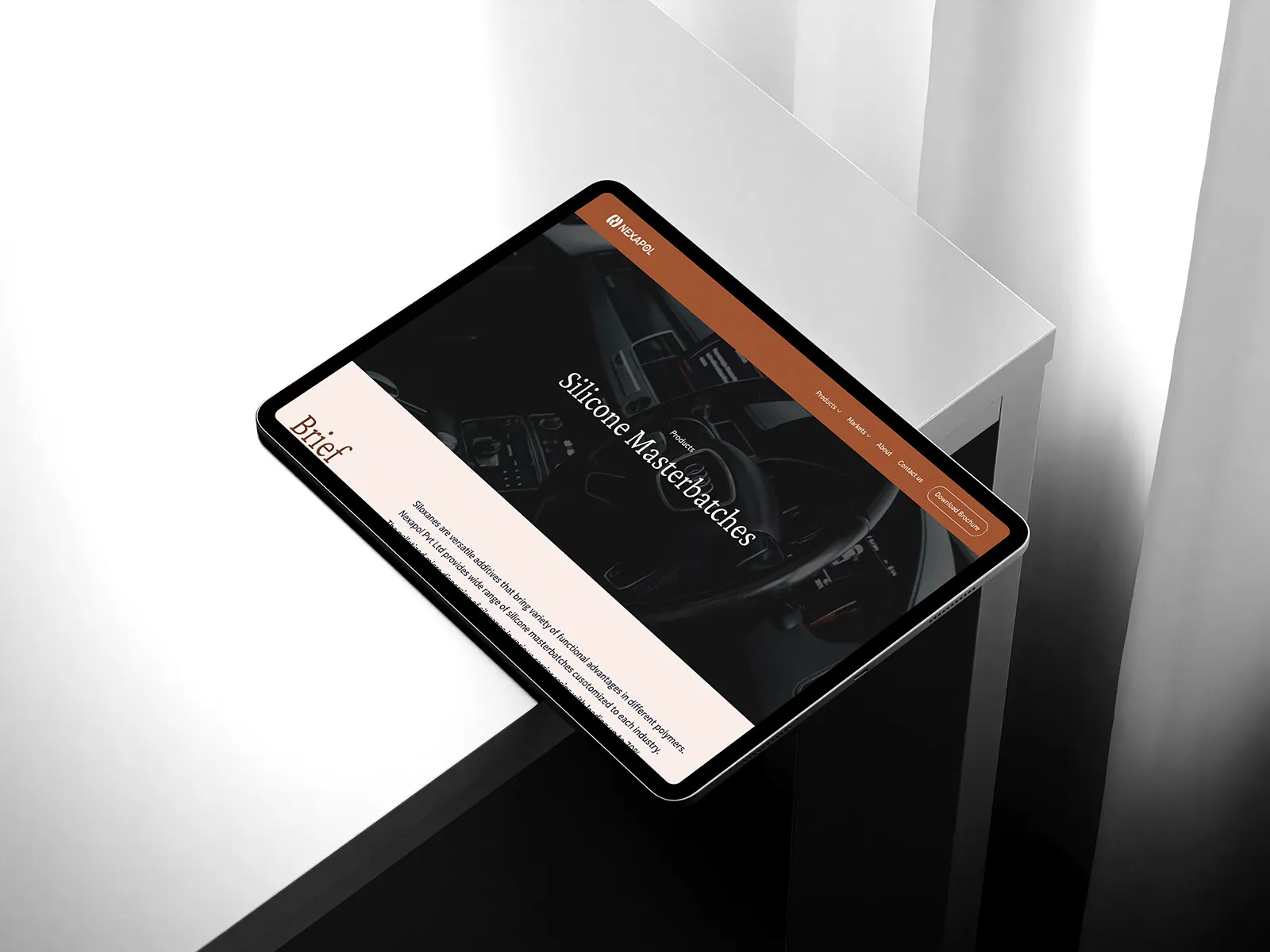
Market page on a tablet

Decision 03

Put a person behind the brand

Why
B2B buyers trust people, not just factories.
What I did
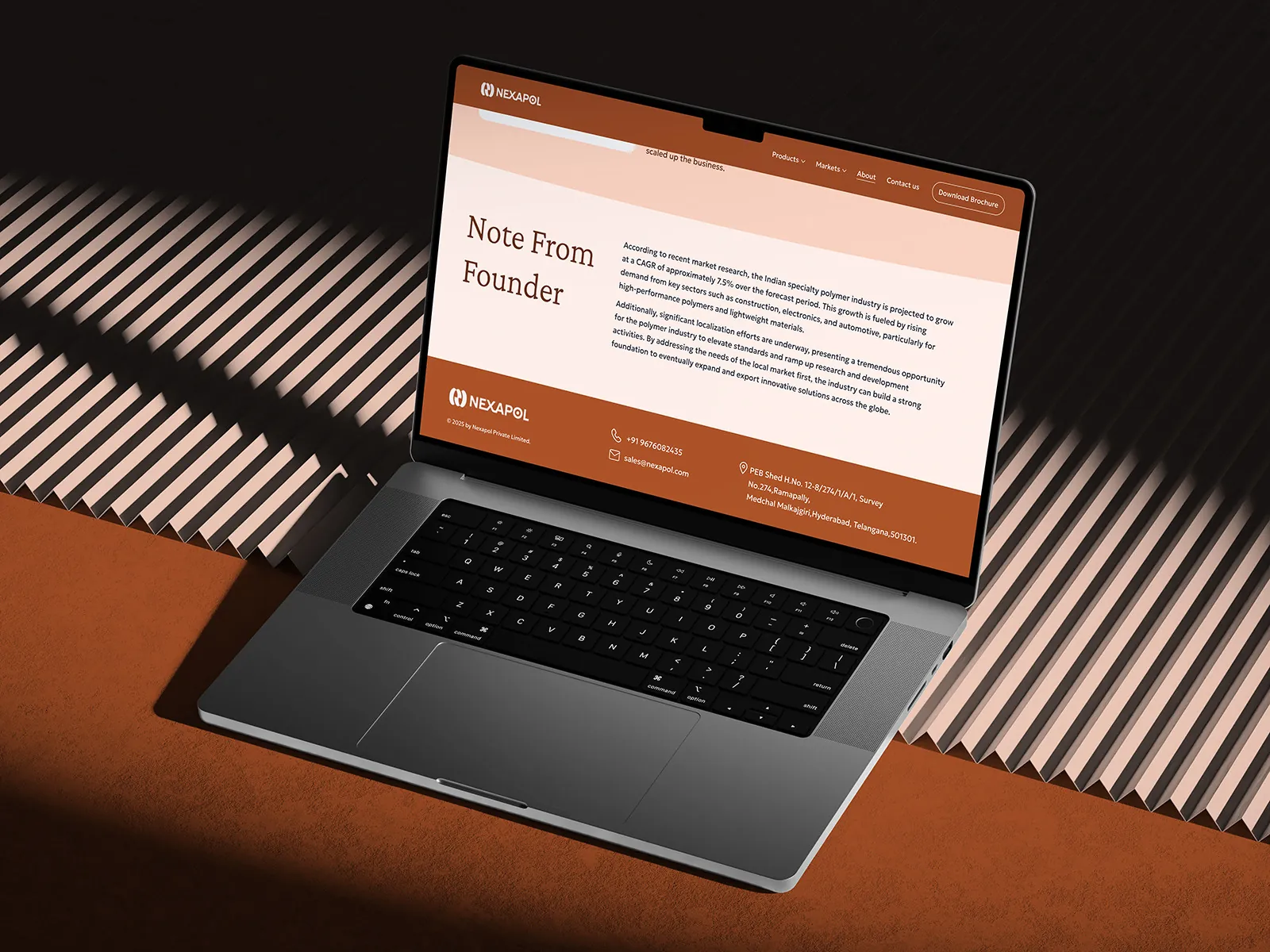
The About page includes a note from the founder, alongside the vision, mission and values.
Note from the founder

05 · The screens

Five layouts, one bold brand

  • Home
  • About
  • Each product
  • Each market
  • Contact
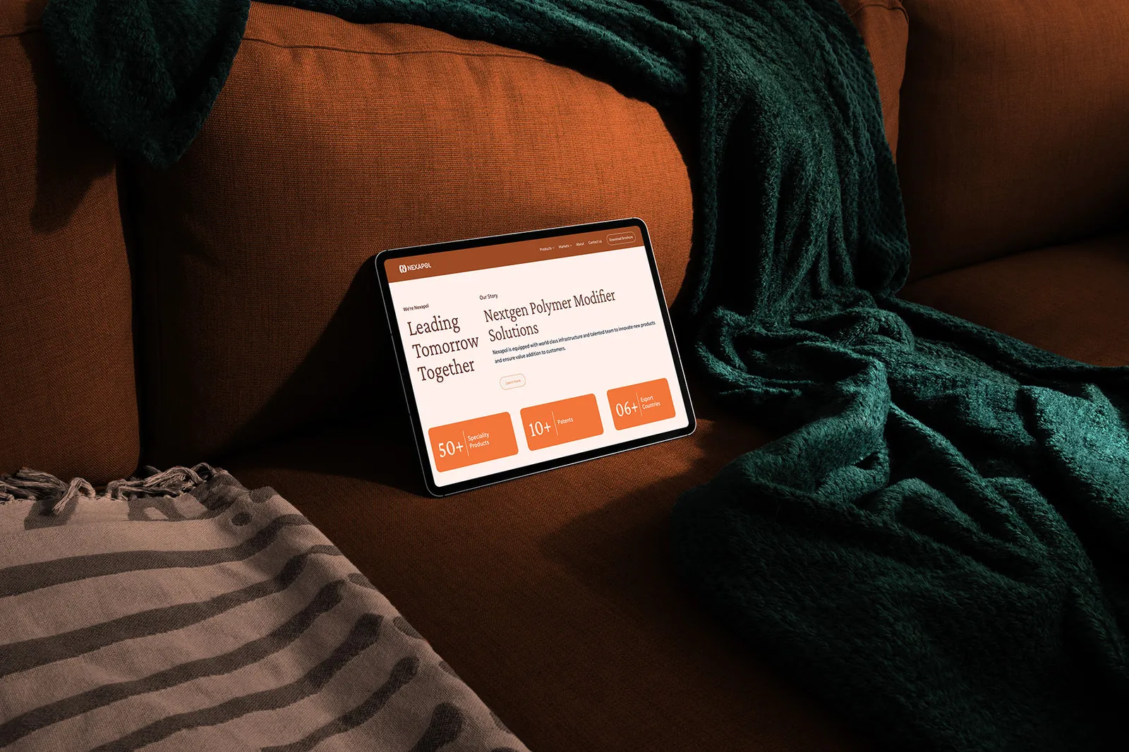
Home page
Home page on a tablet
Market page
Brief section
Note from the founder

Does your industry look dated online?

  • I make “boring” industries look modern and trustworthy.
  • Clear structure so business buyers find answers fast.
  • Two weeks from brief to a site ready to build.

Next case study

Nrture AI →

Thousands of guest reviews turned into clear, revenue‑ready decisions.
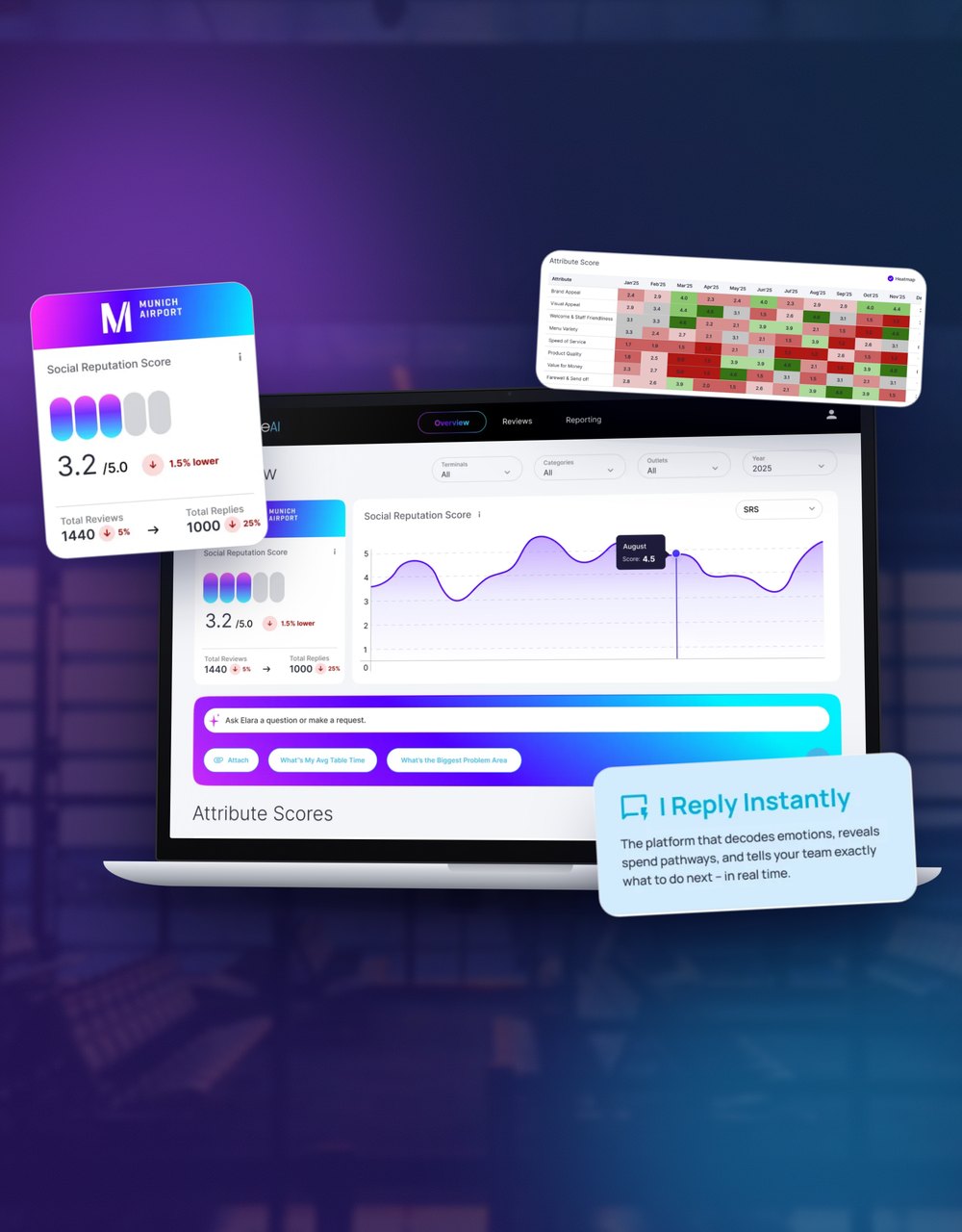
Nrture AI dashboard