Case study · Interior design · Website

A website that feels like a well‑drawn plan.

A portfolio site for Metaphor Interiors, the interior studio from Organo Eco‑Habitats, designed and built in Webflow in two weeks.
Client
Organo Habitats
Industry
Interior design · Sustainable living
Product
Portfolio website, built in Webflow
Timeframe
2 weeks
My role
UX + UI design, wireframing, visual design, Webflow development
Tools
Figma, FigJam, Google Meet, Webflow, Adobe Illustrator
Links
Read on Medium · Visit website
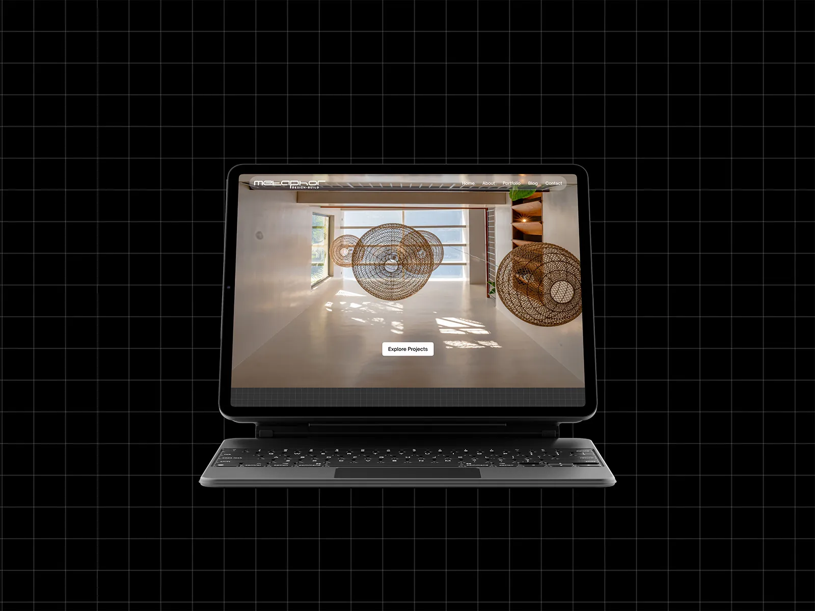
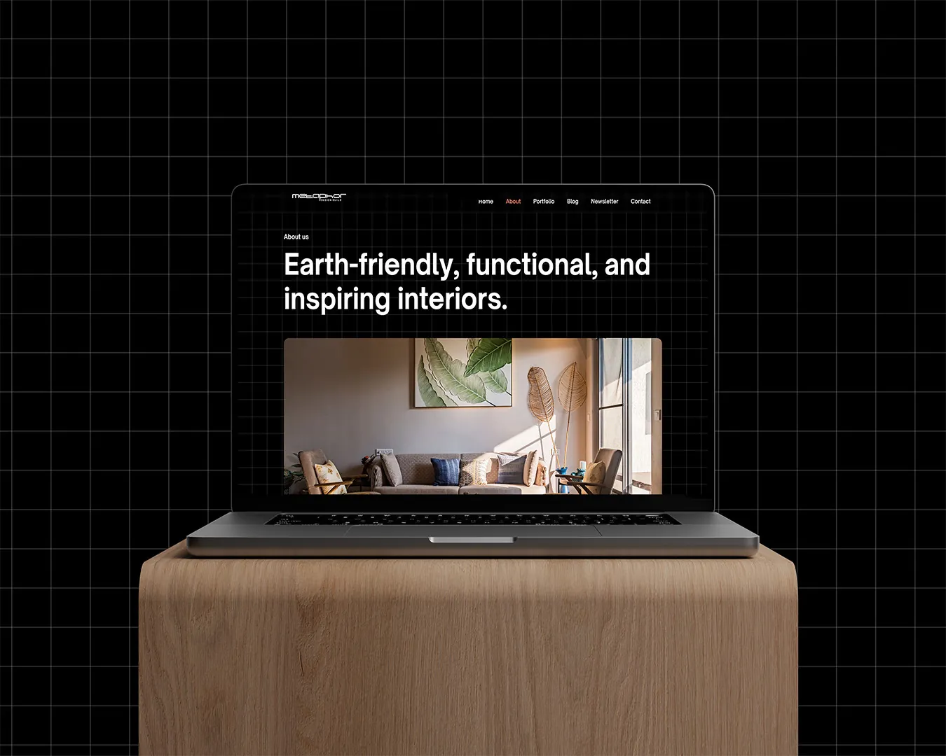
Metaphor Interiors website on a laptop

01 · The short version

The project in a minute

The problem

Beautiful homes, no home online

Metaphor co‑creates thoughtful, stylish homes, but had no digital space that showed the work or the thinking behind it.

What I did

Design, then build it myself

Mapped seven page layouts, designed them around a single architectural grid, and built the whole site in Webflow.

The result

A calm, crafted portfolio

A site that lets the photography lead and feels as considered as the interiors it shows. Live in two weeks.

2weeks from first call to a built site
7page layouts, from home to contact
3audiences: young adults, IT employees, business people
1grid system behind every page

02 · Who it's for

Built for people planning a home

Young buyers and busy professionals browse on their own time. They want to see real work, trust the team, and get in touch easily.

Primary users

Young adults · IT employees · Business people

“Show me homes I'd love to live in, and make it easy to start a conversation.”The brief in one line, as I framed it

  1. See the workClear, HD photos of every finished project.
  2. Trust the teamWho they are and what they stand for.
  3. Get ideasA blog and a free monthly newsletter.
  4. Feel the craftA calm, structured look that mirrors good design.
  5. Reach out easilyA short contact form that turns visits into leads.

03 · How it came together

Two weeks, design to live

Because I designed and built it, nothing got lost between the mockups and the browser.

  1. 1

    Step 1

    Map

    Calls with the team, the site map, and the seven page layouts it needed.

    • Site map
    • Wireframes
  2. 2

    Step 2

    Design

    The grid, type and photography direction, then every page designed in Figma.

    • The grid
    • Visual design
  3. 3

    Step 3

    Build

    The full site built in Webflow, with motion and responsive layouts.
    • Webflow
    • Launch
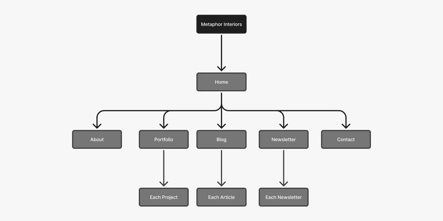
Metaphor Interiors site map
The site map: Home leads to About, Portfolio, Blog, Newsletter and Contact, each with its own detail pages.

04 · Key decisions

The choices that made it work

Decision 01

The grid is the brand

Why
Architects plan everything on a grid. The website should feel drafted with the same care.
What I did
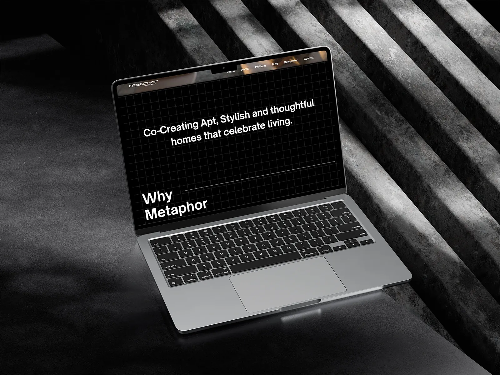
A subtle grid runs behind every page and lines up the content, so the site feels measured, ordered and calm.
Website page with the visible grid

Decision 02

Let the photographs lead

Why
People judge an interior studio by the rooms it has finished, not by what it says.
What I did
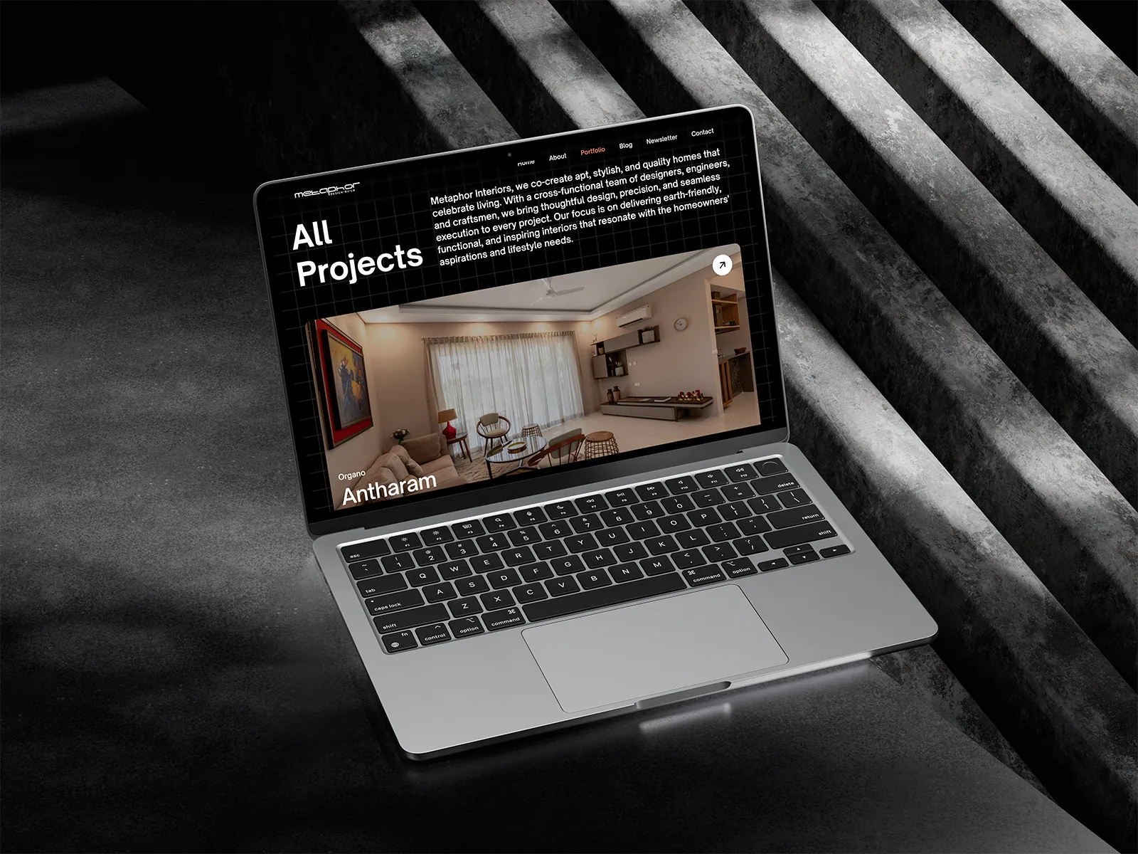
Portfolio and project pages give large, high‑quality photos most of the space, with short text beside them.
All projects page

Decision 03

Make it easy to keep fresh

Why
A blog and a monthly newsletter only work if new posts are easy to add.
What I did
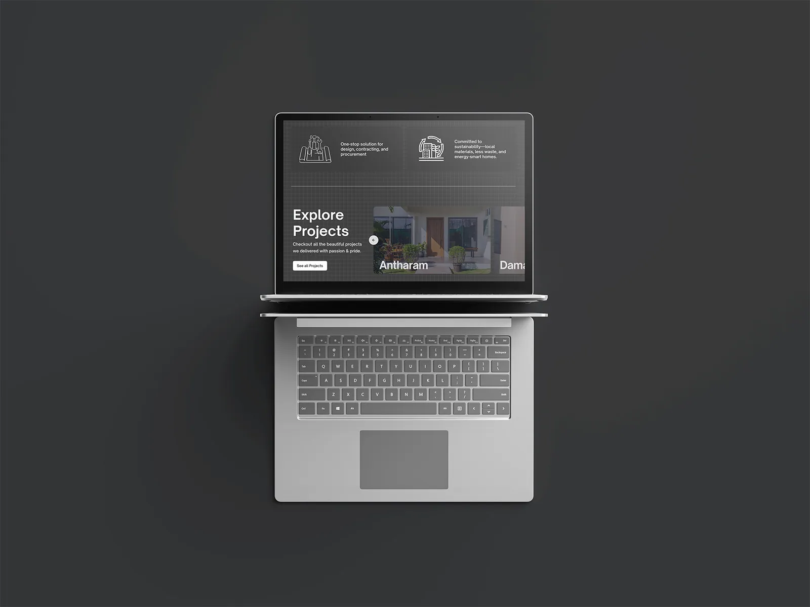
Built in Webflow with ready layouts for posts and issues, so the team can publish without a developer.
Explore projects page

05 · The screens

Seven layouts, one quiet grid

  • Home
  • About us
  • Portfolio
  • Each project
  • Blog
  • Newsletter
  • Contact
Why Metaphor section
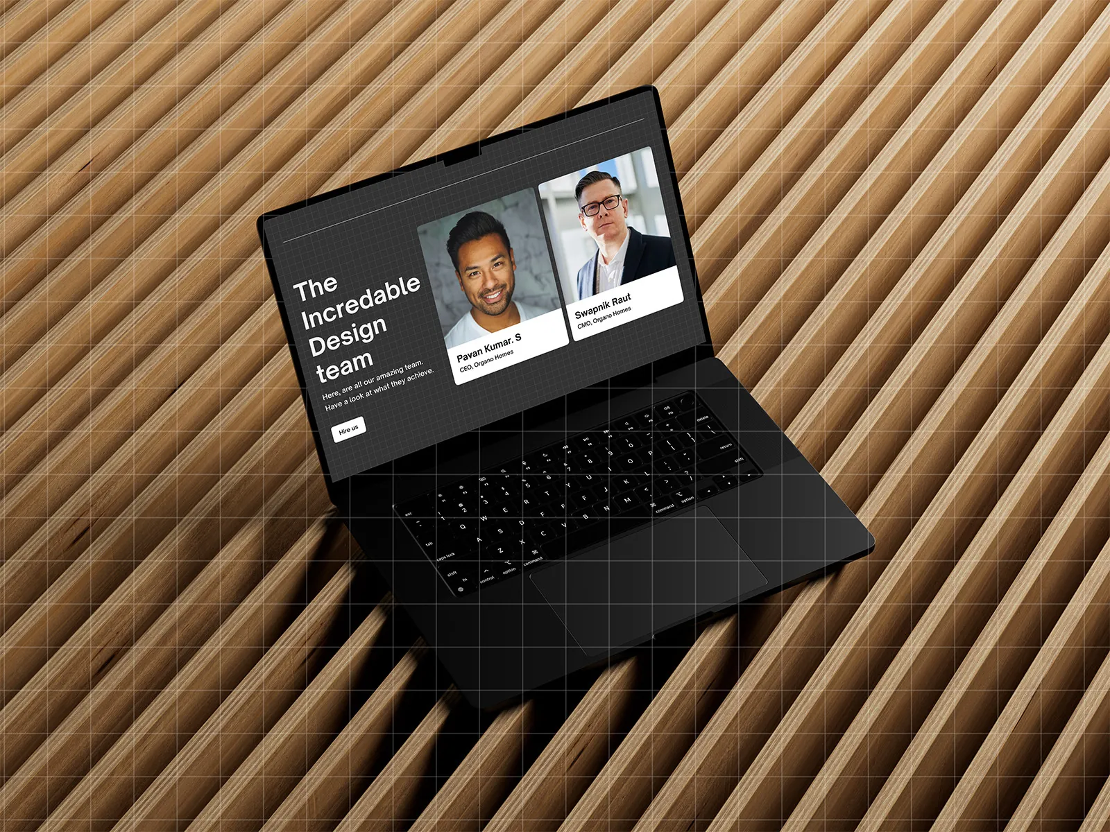
The design team
Project page on a tablet
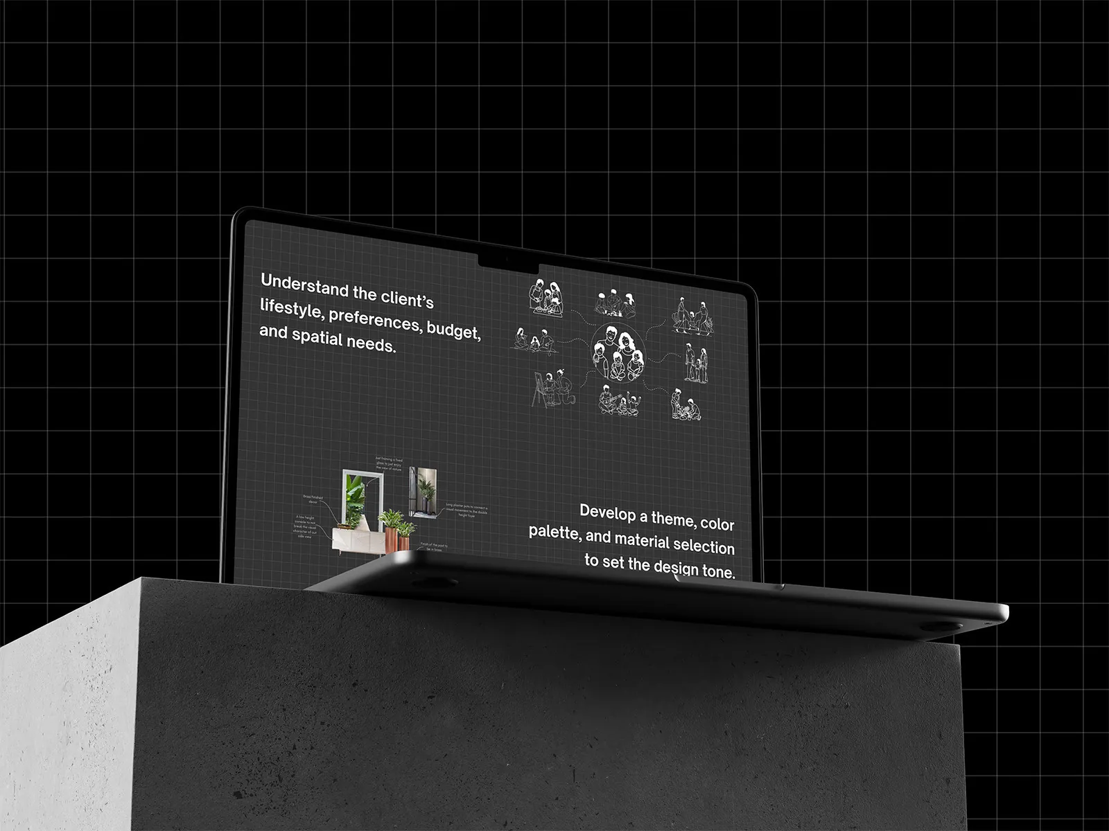
Design process section
All projects page
Explore projects

Need a site that shows your craft?

  • I design and build in Webflow, so what you approve is what goes live.
  • A strong idea, like a grid, that ties every page together.
  • Two weeks from first call to a finished site.

Next case study

Real Ease →

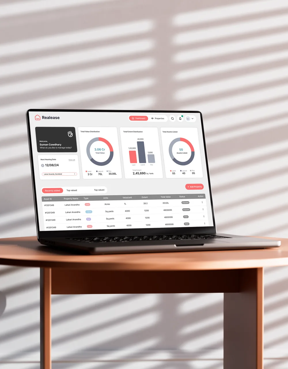
Lands, layouts and plots, all managed in one place.
Real Ease property platform