5 UX Instagram profiles worth following
Instagram can be a surprisingly good place to learn UX, one carousel at a time. These five profiles share useful, practical ideas, plus a few tips to make your feed teach you instead of distract you.
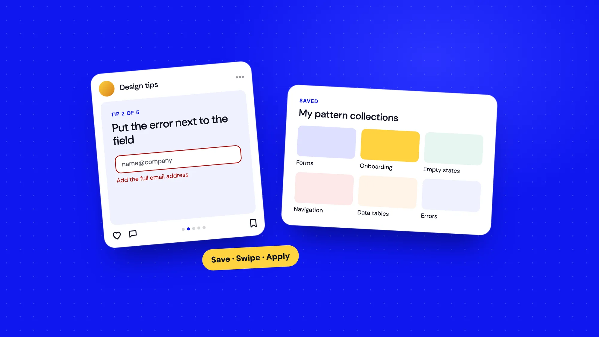
Instagram isn't the first place you'd go to learn design. It's built for scrolling, not studying. But a handful of creators and organisations have turned the humble carousel into a genuinely good learning format: one idea, a few slides, clear visuals.
Used well, a feed like that can top up your knowledge in small doses every day. Here are five profiles I'd recommend, and how to follow them without falling into the scroll.
1. Nielsen Norman Group (@nngux)
NN/g's Instagram turns their research-based articles into short visual summaries. Expect clear explanations of usability principles, research methods and common design mistakes.
Best for: research-backed fundamentals in bite-sized form. If a post sparks your interest, the full article is usually a search away on their website.
2. Interaction Design Foundation (@interactiondesfoundation)
The Interaction Design Foundation is an online learning platform for UX, with a large library of courses and articles. Their Instagram shares quick explainers on UX concepts, psychology and process.
Best for: beginners and career changers who want to build a vocabulary of UX ideas. The posts are a good starting point for deeper reading in their free literature section.
3. Jan Mraz (@janm_ux)
Jan is a designer who shares practical UX and UI tips in carousels: layout, typography, components, tools and workflows, often with clear before-and-after comparisons.
Best for: quick visual lessons you can apply to your next screen. Before-and-after posts are especially useful for training your eye on details like spacing and alignment.
4. Aneta Kmiecik (@ux.aneta)
Aneta shares step-by-step carousels that walk through common design problems, from forms and navigation to accessibility. She also publishes on YouTube and LinkedIn.
Best for: concrete examples of good and bad patterns. The step-by-step format mirrors how you'd actually fix a design, which makes the lessons easy to apply.
5. Figma (@figma)
Figma's official account shares product updates, community work, tips and highlights from Config. It's less about UX theory and more about craft and what other designers are making.
Best for: staying current with the tool and getting inspired by the community. New features often change how teams work, and you'll hear about them here first.
Why these five
I picked these for a mix of sources: a research firm, a learning platform, two independent designers and the tool most of us use every day. Together they cover the why, the how and the what's new. Organisations give you depth and credibility. Independent creators give you practical, opinionated takes from people doing the work. Following a blend keeps your feed from becoming an echo chamber of one style or one point of view.
Accounts do change over time, so check each profile is still active and still useful to you before following. A good rule: if an account hasn't taught you something in a month, it's earned an unfollow.
What makes a UX post worth saving
Beyond these five, you'll come across hundreds of design accounts. A quick way to judge a post is to ask whether it does three things.
- It names a problem. "Users miss the error message" is more useful than "clean form design".
- It explains why. A good post tells you the principle behind the fix, so you can apply it elsewhere.
- It shows a realistic example. Real content and real constraints beat perfect mock data.
Posts that tick all three are rare, which is exactly why the accounts that produce them consistently are worth following. Posts that are only beautiful are fine for inspiration, but treat them as moodboard material, not lessons.
A word of caution
Short posts simplify by design. A carousel that says "never use a hamburger menu" or "always put the button on the right" is a starting point for thinking, not a rule. Real design decisions depend on your users, your context and your product.
- Treat posts as prompts. If an idea is interesting, go and read the research behind it.
- Be wary of absolute rules. Good UX advice usually starts with "it depends".
- Don't copy a beautiful UI shot without knowing the problem it solved. Pretty isn't the same as usable.
Make your feed work for you
The difference between learning on Instagram and wasting time on it comes down to a few habits.
- Use the save button and create collections like "Forms", "Navigation" and "Onboarding". Before you design that pattern, look through your collection.
- Mute or unfollow accounts that post mostly inspiration without explanation.
- Set a time limit. Ten minutes over coffee is plenty.
- When a tip is useful, try it in your current project within a day or two, while it's fresh.
I keep saved collections for patterns I design often, like data tables, empty states and onboarding. When a new project starts, five minutes in those folders gives me a quick set of references to react to.
Follow people who explain, not just people who impress.
Turn saves into a pattern library
Saving posts is easy. Using them is the hard part. A small weekly routine turns a messy pile of saves into something genuinely useful.
- Once a week, spend ten minutes going through new saves.
- Move each one into a named collection, or delete it if it no longer feels useful.
- For the best ones, take a screenshot and drop it into a Figma page called "References", grouped by pattern, with a one-line note on why it works.
- Link to the original creator, so you can credit them if the idea ends up shaping your work.
After a few months you'll have a reference board that's tuned to your work, not someone else's moodboard.
Share what you learn
The profiles above all started the same way: someone sharing what they were learning. You don't need a big audience to benefit from doing the same.
- Explaining an idea in a few slides forces you to understand it properly.
- A small, consistent feed of thoughtful posts is a living portfolio of how you think.
- Before-and-after posts of your own redesigns show your process better than any case study intro.
- Always credit the original source when you're summarising someone else's idea.
Even one post a month adds up. A year from now, you'll have twelve clear explanations of things you understand deeply, and that's worth more than any number of followers.
Balance your diet
Instagram works best as one ingredient in your learning, not the whole meal. Pair it with deeper sources, like the books and blogs I've written about, and with the most important source of all: watching real people use your product.