Clarity beats clever: designing screens people understand at first glance
People don't read your interface, they scan it between meetings and notifications. Here's how I design screens that make sense in five seconds, and the simple tests I use to check.
Nobody opens your product with a cup of coffee and an empty afternoon. They open it between two meetings, with a notification sliding in and a colleague asking a question. They glance, they guess, and they either get it or they leave.
That's why I've stopped chasing clever. A clever layout wins likes on Dribbble. A clear one wins users who come back on Monday. After years of designing dashboards, admin panels and websites, clarity is the one quality I've never seen go out of fashion.
Why clever loses
Every screen asks for attention, and attention is limited. Each unfamiliar icon, vague label or competing button spends a little of it. Spend too much and people feel tired, even if they can't say why. They'll describe the product as "confusing" or "heavy", and they won't be wrong.
Clever designs usually spend attention on the designer's idea instead of the user's task. A hidden menu that slides in from an unusual corner, a button labelled with a pun, a chart that looks stunning but needs a legend to decode. Each one is a small puzzle. Users didn't come to solve puzzles.
If a screen needs a tour to be understood, the screen is the problem, not the user.
1. One screen, one job
Before I design a screen, I write one sentence: what is this screen for? "Help a finance lead see if this month's spend is on track." "Let a new user add their first property." If I can't write that sentence, the screen isn't ready to be designed.
That sentence becomes a filter. Anything that doesn't help with the job either moves to another screen or disappears. It's the fastest way to stop a page from becoming a junk drawer of everyone's favourite feature.
2. Let hierarchy do the talking
People decide where to look based on size, weight, colour and space long before they read a word. Use that. The most important thing on the screen should be the most visible thing on the screen. Not equally visible. Clearly, obviously first.
- One primary action per screen. If everything is a big blue button, nothing is.
- Group related things and give unrelated things room. White space is not wasted space, it's punctuation.
- Use size and weight before colour. Colour should carry meaning, like status or errors, not decoration.
- Line things up. Alignment makes a screen feel calm, even when it's full of data.
A quick way to check: squint at your design until the text blurs. Whatever still stands out is what users will see first. If it's the wrong thing, fix the hierarchy before you touch anything else.
3. Words are interface
Half of clarity is writing. A button that says "Submit" tells me nothing. A button that says "Create account" or "Send invoice" tells me exactly what will happen when I press it. Labels should describe outcomes, in the words your users already use.
- Use verbs on buttons: "Download report", not "Report".
- Swap internal jargon for everyday language. Your team may say "entities". Your users say "companies".
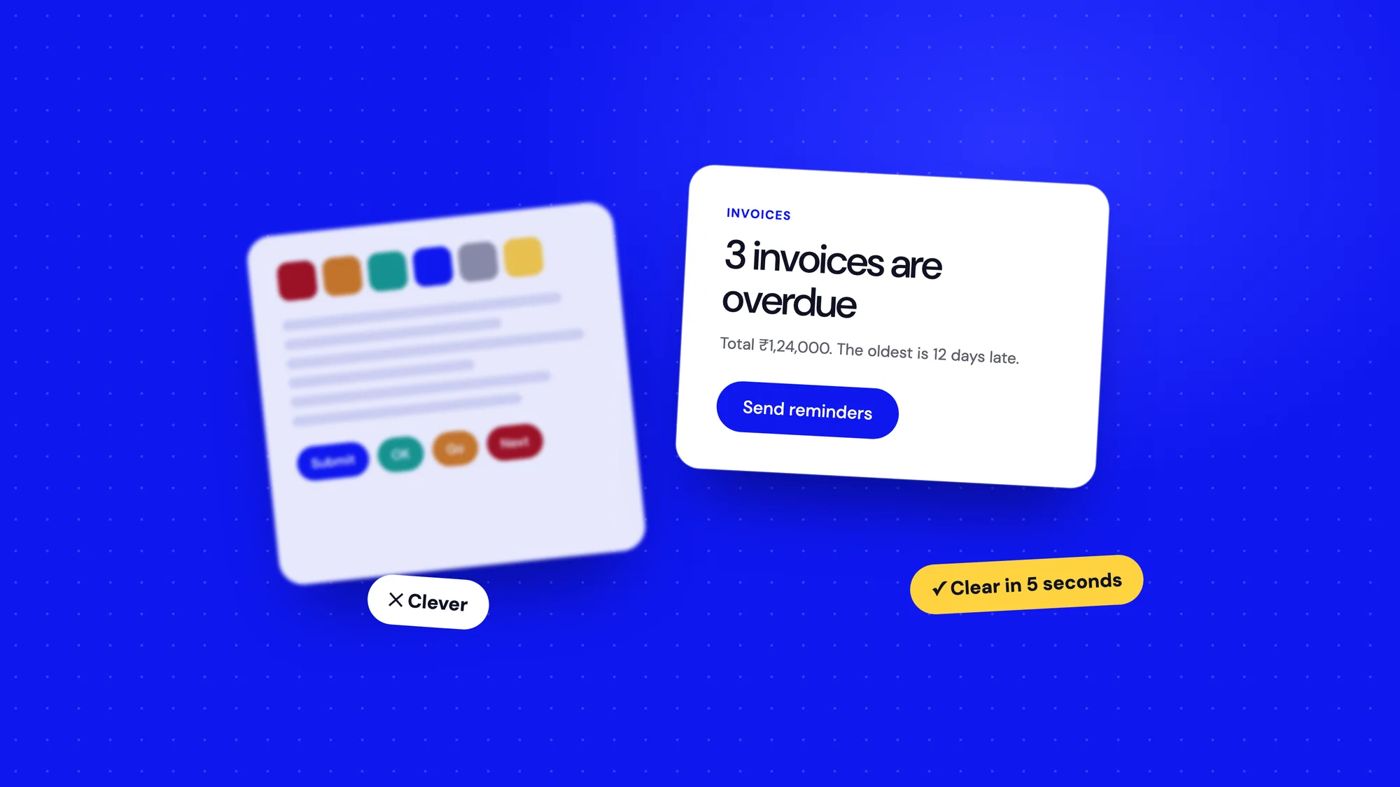
- Front-load the important word. "Invoices overdue: 3" scans faster than "You currently have 3 invoices that are overdue".
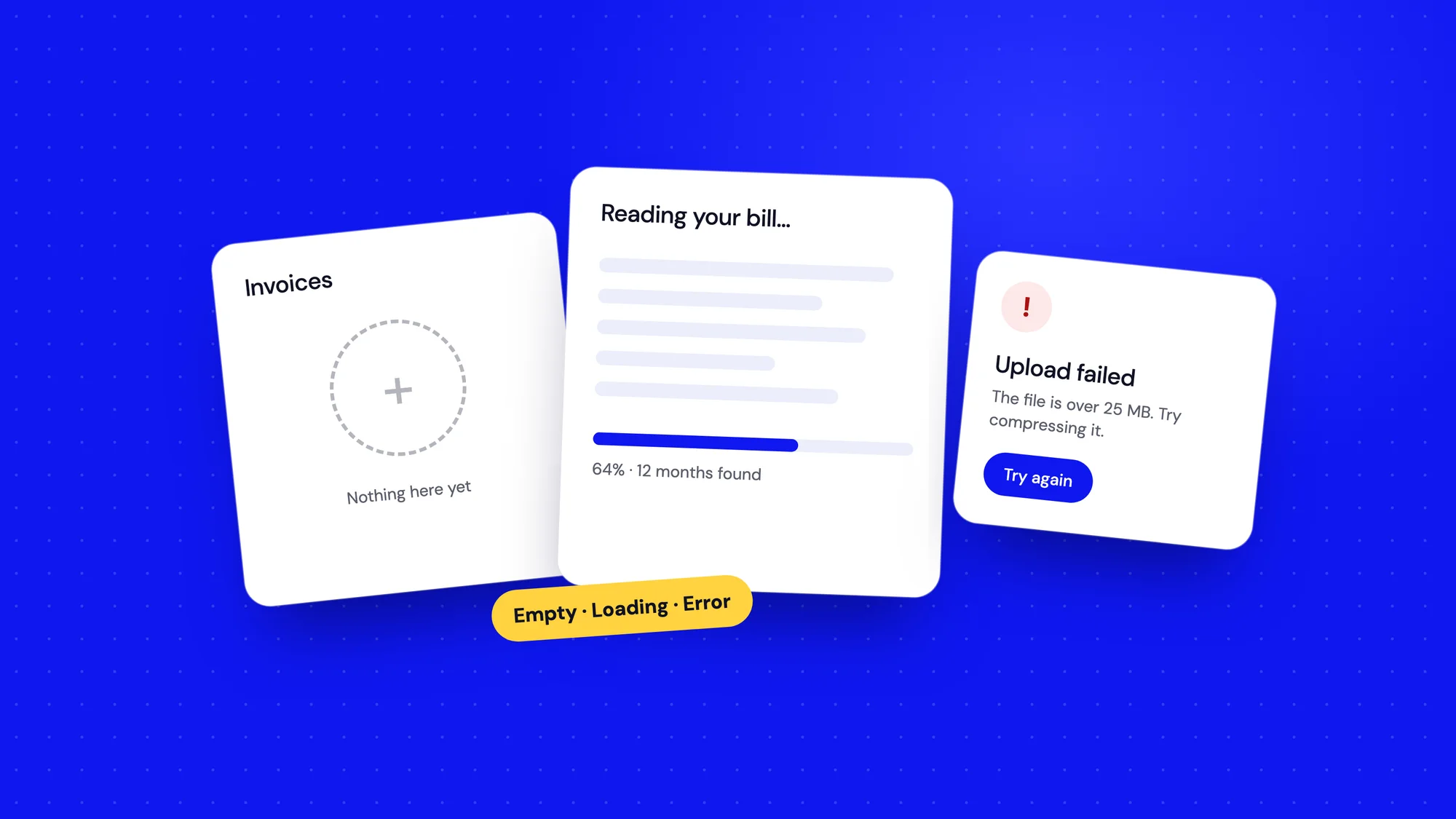
- Write empty states and errors with the same care as headlines. They're read at the most stressful moments.
On complex products, like carbon accounting, the temptation is to show expertise through vocabulary. I've found the opposite works. Plain words make experts faster and give newcomers the confidence to keep going.
4. Familiar beats novel
Your users spend most of their day in other products: email, spreadsheets, chat, their bank's app. They arrive at yours with habits already formed. Search lives at the top. The logo goes home. A trash icon deletes. Work with those habits, not against them.
Save originality for the moments that matter, like a delightful onboarding or a chart that tells a story better than anyone else's. Everywhere else, be boringly predictable. Predictable is a compliment when people are trying to get work done.
5. Always answer three questions
At any moment, a user should be able to answer: where am I, what just happened, and what can I do next? Most confusion comes from one of these going unanswered.
- Where am I: a clear page title, an active state in the navigation, breadcrumbs for deep pages.
- What just happened: confirmation after saving, progress while something loads, a clear message when it fails.
- What next: a visible next step, especially on empty screens and after finishing a task.
6. Remove before you add
When a screen feels confusing, the instinct is to add something: a tooltip, a help icon, an onboarding pop-up. Sometimes that's right. More often, the better fix is to take something away. Fewer options, fewer words, fewer colours.
I keep a simple rule for reviews. For every element on the screen, ask: what would break if this disappeared? If the honest answer is "nothing much", it goes. You'll be surprised how much survives on habit alone.
7. Data screens need a headline
Dashboards are where clarity goes to die. Teams pull every metric they can find, arrange them in a neat grid of cards and call it visibility. Then the people it was built for open it, see forty numbers of equal weight and close it again.
Treat a data screen like a newspaper front page. It needs a headline: the single most important thing someone should know right now. Supporting numbers come next, and detail lives one click deeper.
- Lead with a sentence where you can: "Spend is 8% over budget, mostly from travel" beats a lonely 8%.
- Show change and direction, not just totals. Most people want to know if things are getting better or worse.
- Pick the simplest chart that answers the question. A bar chart is rarely the wrong choice.
- Make the next step obvious: the report to open, the person to call, the task to do.
Common clarity killers
When I review a confusing screen, the cause is usually one of a handful of repeat offenders:
- Icons without labels, especially in navigation.
- Two or three buttons of equal weight fighting for attention.
- Grey text on grey backgrounds that's hard to read.
- Settings and options shown before people need them.
- Different words for the same thing on different screens.
- Long paragraphs of instructions that nobody reads.
Fixing even two of these on a key screen often makes a bigger difference than a full redesign.
How I test for clarity
You don't need a lab to check whether a design is clear. These quick tests take minutes and catch most problems before they reach users.
- The five-second test: show the screen to someone for five seconds, hide it, and ask what it was for. If they can't tell you, neither will your users.
- The read-aloud test: read every label and button out loud. Anything that sounds odd spoken will feel odd on screen.
- The new-joiner test: ask someone outside the project to complete one task without help. Watch where they hesitate.
- The squint test: blur your eyes and see what stands out first.
None of these replace proper research, but they're cheap enough to run on every screen, every week. That habit matters more than any single big study.
Clarity is a kindness
Clear design respects people's time. It assumes they're busy, distracted and capable, which is true of almost everyone. It doesn't make them feel slow for not understanding a clever idea.
Trends will keep changing. Glassmorphism will come and go, colours will swing from muted to loud and back again. But a screen that can be understood in five seconds will always be in style.
The best compliment a product can get isn't "beautiful". It's "obvious".